Content from Clustering Introduction
Last updated on 2025-01-27 | Edit this page
Download Chapter notebook (ipynb)
Mandatory Lesson Feedback Survey
Overview
Questions
- How to search for multiple distributions in a dataset?
- How to use Scikit-learn to perform clustering?
- How is data labelled in unsupervised learning?
- How can we score clustering predictions?
Objectives
- Understanding Multiple Gaussian distributions in a dataset.
- Demonstrating Scikit-learn functionality for Gaussian Mixture Models.
- Learning automated labelling of dataset.
- Obtaining a basic quality score using a ground truth.
Prerequisite
Import functions
PYTHON
from numpy import arange, asarray, linspace, zeros, c_, mgrid, meshgrid, array, dot, percentile
from numpy import histogram, cumsum, around
from numpy import vstack, sqrt, logspace, amin, amax, equal, invert, count_nonzero
from numpy.random import uniform, seed, randint, randn, multivariate_normal

from matplotlib.pyplot import subplots, scatter, xlabel, ylabel, axis, figure, colorbar, title, show
from matplotlib.colors import LogNorm

from pandas import read_csv
Example
Import the patients data, scatter the data for Weight and Height and get a summary statistics for both.
PYTHON
df = read_csv("data/patients_data.csv")

# Weigth to kg and height to cm
pound_kg_conversion = 0.45
inch_cm_conversion  = 2.54

df['Weight'] = pound_kg_conversion*df['Weight']
df['Height'] = inch_cm_conversion *df['Height']


fig, ax = subplots()

ax.scatter(df['Weight'], df['Height'])

ax.set_xlabel('Weight (kg)', fontsize=16)
ax.set_ylabel('Height (cm)', fontsize=16)

df[['Weight', 'Height']].describe()

show()
OUTPUT
           Weight      Height
count  100.000000  100.000000
mean    69.300000  170.357800
std     11.957139    7.204631
min     49.950000  152.400000
25%     58.837500  165.100000
50%     64.125000  170.180000
75%     81.112500  175.895000
max     90.900000  182.880000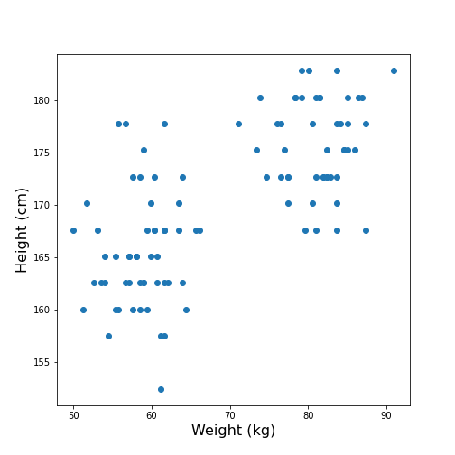
Looking at the data, one might expect that there are two distinct groups, visually identified as two clouds separated e.g. by a vertical line at Weight \(\approx\) 70 (kg). A consequence is that the mean value of 69.3 kg (which was calculated over all samples) should better be replaced by two mean values, one for each of the clouds. Visually, these can be estimated at around 60 and 80 kg.
We can make this even clearer by looking at the two individual distributions.
PYTHON
fig, ax = subplots(ncols=2)

ax[0].hist(df['Weight'], bins=20);
ax[0].set_xlabel('Weight', fontsize=16)
ax[0].set_ylabel('Count', fontsize=16)

ax[1].hist(df['Height'], bins=12);
ax[1].set_xlabel('Height', fontsize=16);

show()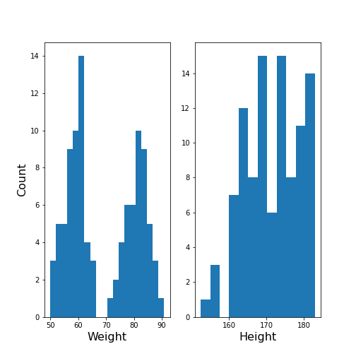
The Weight histogram shows two distributions (at the chosen number of bins) which now also points to the two mean values as guessed above. The Height histogram is at least not compatible with the assumption of a normal distribution as would be expected for a typically noisy variable.
Thus, visual inspection suggests to analyse the data in terms of more than one underlying distribution. The automated assignment of data points to distinct groups is called clustering.
We now want to learn to use the Gaussian Mixture Model approach to find those groups. As we will not provide any labels for the training, this presents an example of unsupervised machine learning. Algorithms of this type of machine learning are designed to learn to optimally assign labels through training. As a result, we will be able to separate a dataset into groups and be able to predict the labels of new, unlabelled data.
Gaussian Mixture Models
A Gaussian Mixture Models (GMM) approach assumes that the data are composed of two or more normal distributions that may overlap. In a scatter plot that means that there is more than one centre in the density distribution of the data (see scatter plot above). The task is to find the centres and the spread of each distribution in the mixture. The GMM algorithm thus belongs to the category of (probability) Density Estimators. Another way of grouping is to find a curve that splits the plane into two areas.
The GMM assumes normally distributed data structure from at least two sources. Other than that it does not make assumptions about the data.
GMM is a parametric learning approach as it optimises the parameters of a normal distributions, i.e. the mean and the covariance matrix of each group. It is therefore an example of a model fitting method.
As its name suggests, it assumes that the distribution of each group is normal. If the groups are known to have a non-normal distribution, it may not be the optimal approach.
GMM is one example of clustering or cluster analysis. Whenever we suspect that a data set contains contributions of qualitatively different types, we can consider doing a cluster analysis to separate those types. However, this is a vague notion and clustering is therefore a complex field. We can only provide an introduction to its basic components. The main point to keep in mind is that the algorithms provided e.g. by Scikit-learn will always give some result but that it is not easy to assess the quality of the results. Scikit-learn has a good overview of clustering methods showing advantages and disadvantages of each. Here is a link to a readable introduction about the cautious application and the pitfalls of clustering.
Work Through Example
Creating test data
Let us create synthetic data for testing of the clustering algorithm. We do this according to the assumptions of GMM: we create two Gaussian data sets with different means and different standard distributions and add them together. For illustration we only use two features.
The example is adapted from a Scikit-learn example. It uses the concept of covariance matrix which is the extension of variance (or standard deviation) to multivariate datasets.
PYTHON
n_samples = 500
m_features = 2

# Seed the random number generator
RANDOM_NUMBER = 1
seed(RANDOM_NUMBER)

# Data set 1, centered at (20, 20)
mean_11 = 20
mean_12 = 20

gaussian_1 = randn(n_samples, m_features) + array([mean_11, mean_12])


# Data set 2, zero centered and stretched with covariance matrix C
C = array([[1, -0.7], [3.5, .7]])

gaussian_2 = dot(randn(n_samples, m_features), C)


# Concatenate the two Gaussians to obtain the training data set
X_train = vstack([gaussian_1, gaussian_2])

print(X_train.shape)

fig, ax = subplots()

ax.scatter(X_train[:, 0], X_train[:, 1]);

show()
OUTPUT
(1000, 2)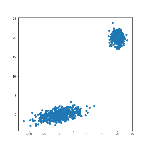
The scatter plot showes that this method allows the adjustment of the centres of the distributions as well as the elliptic shape of the distribution.
Now we fit a GMM. Note that the GMM needs to be told how many components one wants to fit. Modifications that estimate the optimal number of components exist but we will restrict the demonstration to the method that directly sets the number.
Analogous to the classifier in supervised learning, we instantiate the
model from the imported class GaussianMixture. The
instantiation takes the number of independent data sets (clusters) as an
argument. By default, the classifier tries to fit the full covariance
matrix of each group. The fitting is done using the method
fit.
PYTHON
from sklearn.mixture import GaussianMixture

# Fit a Gaussian Mixture Model with two components

components = 2

clf = GaussianMixture(n_components=components)

clf.fit(X_train)GaussianMixture(n_components=2)In a Jupyter environment, please rerun this cell to show the HTML representation or trust the notebook.
On GitHub, the HTML representation is unable to render, please try loading this page with nbviewer.org.
GaussianMixture(n_components=2)
After the fitting of the model, we first create a meshgrid of the
(two-dimensional) state space. For each point in this state space, we
obtain the predicted scores using the method
.score_samples. These are the weighted logarithmic
probabilities which show the predicted distribution of points in the
state space.
PYTHON
resolution = 100

vec_a = linspace(-60., 80., resolution)
vec_b = linspace(-40., 50., resolution)

grid_a, grid_b = meshgrid(vec_a, vec_b)

XY_statespace = c_[grid_a.ravel(), grid_b.ravel()]

Z_score = clf.score_samples(XY_statespace)

Z_s = Z_score.reshape(grid_a.shape)

print(Z_s.shape)
OUTPUT
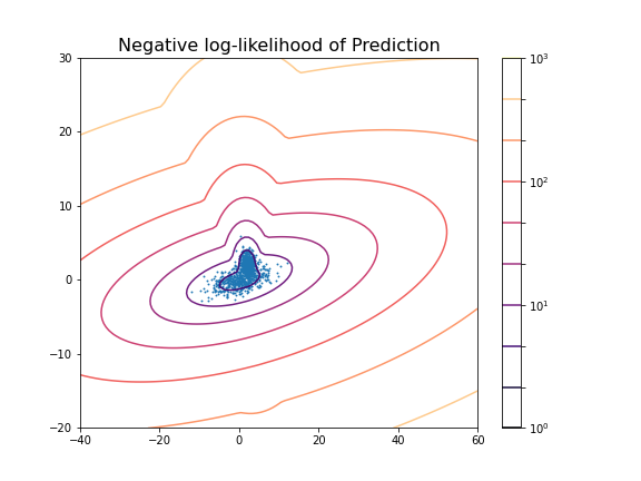
(100, 100)Now we can display the predicted scores as a contour plot. Typically, the negative log-likelihood or density estimation is used for this. In this case, the highest probabilities are shown as a landscape with two minima.
PYTHON
fig, ax = subplots(figsize=(8, 6))

cax = ax.contour(grid_a, grid_b, -Z_s,
           norm=LogNorm(vmin=1.0, vmax=1000.0),
           levels=logspace(0, 3, 10),
           cmap='magma'
          )

fig.colorbar(cax);

ax.scatter(X_train[:, 0], X_train[:, 1], .8)

title('Negative log-likelihood of Prediction', fontsize=16)
axis('tight');

show()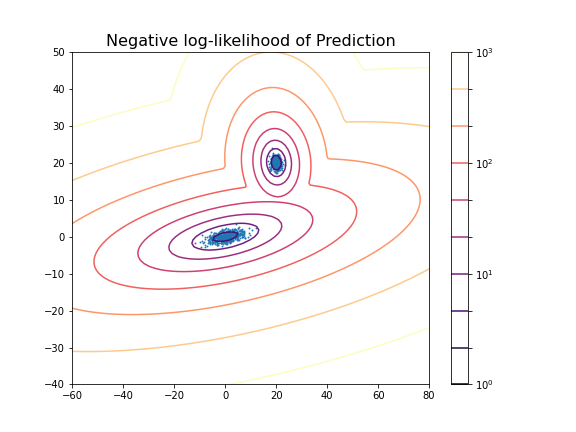
You can change the number of components to see the impact it has on the result. E.g. picking 3 components:
PYTHON
clf_3 = GaussianMixture(n_components=3)

clf_3.fit(X_train)

Z_score_3 = clf_3.score_samples(XY_statespace)

Z_s_3 = Z_score_3.reshape(grid_a.shape)

fig, ax = subplots(figsize=(8, 6))

cax = ax.contour(grid_a, grid_b, -Z_s_3,
           norm=LogNorm(vmin=1.0, vmax=1000.0),
           levels=logspace(0, 3, 10),
           cmap='magma'
          )

fig.colorbar(cax);

title('Negative log-likelihood (3 components)', fontsize=16)
axis('tight');

show()GaussianMixture(n_components=3)In a Jupyter environment, please rerun this cell to show the HTML representation or trust the notebook.
On GitHub, the HTML representation is unable to render, please try loading this page with nbviewer.org.
GaussianMixture(n_components=3)
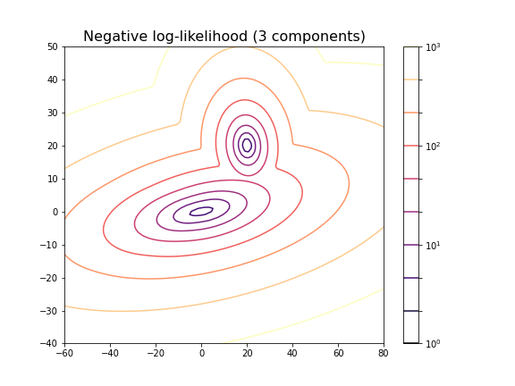
For the choice of 3 components it does not lead to a probability distribution with 3 distinct maxima. This is because two of the maxima coincide or at least nearly coincide.
In our example, the choice of 2 components is very obvious because as done above, we could visualise the complete state space and there was a visually discernible structure in the data. In high-dimensional data the task is difficult and while methods exist to automatically find the optimal number of components for some clustering methods, the success of these depends very much on the problem.
Getting optimal model parameters
Now that the estimator is fitted, we can obtain the optimal parameters
for the fitted components. They are stored in the model attributes. We
can extract (i) the .weights_, the share of each of the
components (Gaussians) in the mixture; (ii) the .means_,
the coordinates of the mean values; and (iii)
.covariances_, the covariance matrix of each component.
PYTHON
components = 2

clf = GaussianMixture(n_components=components);

clf.fit(X_train)

print('Model Weights: ')
print(clf.weights_)
print('')

print('Mean coordinates: ')
print(clf.means_)
print('')
print('Covariance Matrices: ')
print(clf.covariances_)GaussianMixture(n_components=2)In a Jupyter environment, please rerun this cell to show the HTML representation or trust the notebook.
On GitHub, the HTML representation is unable to render, please try loading this page with nbviewer.org.
GaussianMixture(n_components=2)
OUTPUT
Model Weights:
[0.5 0.5]

Mean coordinates:
[[ 2.00467649e+01  2.00308601e+01]
 [ 1.10681138e-01 -6.87868023e-03]]

Covariance Matrices:
[[[ 0.95442218 -0.06641459]
  [-0.06641459  0.97019156]]

 [[13.78557368  1.81677876]
  [ 1.81677876  1.04931994]]]
The fit returns a model where the two components have equal weight. The means and covariance matrices can be compared directly to the values chosen to create the data. They are not identical but good estimates are obtained from a fit to 500 data points in each group.
Create data from optimal model
The result of the fitting are the parameters for two Gaussian distributions with two features each. These parameters can be used to create further model data with the same characteristics. In our demonstration we know the original sources but if the parameters are obtained from experimental or clinical data, it is useful to visualise the predicted distributions using as many samples as necessary.
If we know the mean and the covariance matrix of a Gaussian, the
function multivariate_normal can be used to create data
from that Gaussian.
PYTHON
model1_mean, model2_mean = clf.means_[0], clf.means_[1]
model1_cov, model2_cov =  clf.covariances_[0], clf.covariances_[1]

samples = 100

model1_data = multivariate_normal(model1_mean, model1_cov, samples)
model2_data = multivariate_normal(model2_mean, model2_cov, samples)

fig, ax = subplots()

ax.scatter(model1_data[:, 0], model1_data[:, 1], c='b');
ax.scatter(model2_data[:, 0], model2_data[:, 1], c='r');

show()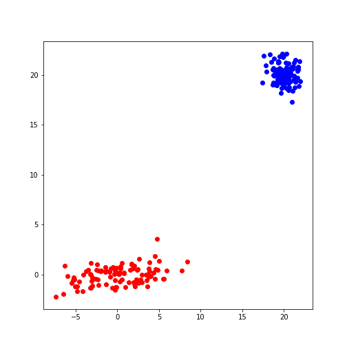
Predicting Labels
Now we can apply what we have discussed in supervised machine learning and use the trained model to predict.
We can get the predictions of the group for new data. Here, for
simplicity, we create test data from the same distribution as the train
data. The label is obtained from the method .predict.
PYTHON
n_samples = 10
m_features = 2

# Seed the random number generator
RANDOM_NUMBER = 111
seed(RANDOM_NUMBER)

# Data set 1, centered at (20, 20)

mean_11 = 20
mean_12 = 20

gaussian_1 = randn(n_samples, m_features) + array([mean_11, mean_12])


# Data set 2, zero centered and stretched with covariance matrix C

C = array([[1, -0.7], [3.5, .7]])

gaussian_2 = dot(randn(n_samples, m_features), C)


# Concatenate the two Gaussians to obtain the training data set
X_test = vstack([gaussian_1, gaussian_2])


# Predict group
y_test = clf.predict(X_test)

print(y_test)
OUTPUT
[0 0 0 0 0 0 0 0 0 0 1 1 1 1 1 1 1 1 1 1]
For simplicity, fit and predict can be combined with the
.fit_predict method to directly get the labels for each
sample. Here is an example where we fit the model to the test data and
directly extract their predicted labels.
PYTHON
components = 2

clf_2 = GaussianMixture(n_components=components, covariance_type='full')

labels = clf_2.fit_predict(X_test)
print(labels)
OUTPUT
[1 1 1 1 1 1 1 1 1 1 0 0 0 0 0 0 0 0 0 0]
The probabilities of the predictions are obtained from the method
.predict_proba. In this case, all probabilities are 0 and 1
respectively. The model is sure about their group signature.
The .sample_ method produces individual samples from the
trained model. It takes the number of required samples as an input
argument and yields the sample values as well as the group for each
sample. Samples for each group are given with probability according to
the group weights.
OUTPUT
[[20.06076245 20.69983729]
 [21.67317947 21.86459529]
 [ 4.90658144 -0.99981225]
 [ 4.74232451  0.2655483 ]
 [ 0.92148265  2.32782549]]

[0 0 1 1 1]
We can now redo the example with two distributions that lie closer together, i.e. making the clustering task harder.
PYTHON
n_samples = 500
m_features = 2

# Seed the random number generator
RANDOM_NUMBER = 1
seed(RANDOM_NUMBER)

# Data set 1, centered at (20, 20)

mean_11 = 2
mean_12 = 2

gaussian_1 = randn(n_samples, m_features) + array([mean_11, mean_12])


# Data set 2, zero centered and stretched with covariance matrix C

C = array([[1, -0.7], [3.5, .7]])

gaussian_2 = dot(randn(n_samples, m_features), C)


# Concatenate the two Gaussians to obtain the training data set
X_train = vstack([gaussian_1, gaussian_2])

print(X_train.shape)

fig, ax = subplots()

ax.scatter(X_train[:, 0], X_train[:, 1]);

show()
OUTPUT
(1000, 2)
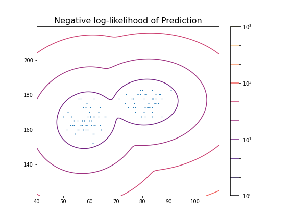
PYTHON
components = 2

clf2 = GaussianMixture(n_components=components)

clf2.fit(X_train)

resolution = 100

vec_a = linspace(-40., 60., resolution)
vec_b = linspace(-20., 30., resolution)

grid_a, grid_b = meshgrid(vec_a, vec_b)

XY_statespace = c_[grid_a.ravel(), grid_b.ravel()]

Z_score = clf2.score_samples(XY_statespace)

Z_s = Z_score.reshape(grid_a.shape)

fig, ax = subplots(figsize=(8, 6))

cax = ax.contour(grid_a, grid_b, -Z_s,
           norm=LogNorm(vmin=1.0, vmax=1000.0),
           levels=logspace(0, 3, 10),
           cmap='magma'
          )

fig.colorbar(cax);

ax.scatter(X_train[:, 0], X_train[:, 1], .8)

title('Negative log-likelihood of Prediction', fontsize=16)
axis('tight');

show()GaussianMixture(n_components=2)In a Jupyter environment, please rerun this cell to show the HTML representation or trust the notebook.
On GitHub, the HTML representation is unable to render, please try loading this page with nbviewer.org.
GaussianMixture(n_components=2)
PYTHON
print('Model Weights: ')
print(clf2.weights_)
print('')

print('Mean coordinates: ')
print(clf2.means_)
print('')

print('Covariance Matrices: ')
print(clf2.covariances_)
print('')

y_predict = clf2.predict(X_train)

print('Predicted Labels')
print(y_predict)
OUTPUT
Model Weights:
[0.51626883 0.48373117]

Mean coordinates:
[[ 2.02822009  2.0218213 ]
 [ 0.06535904 -0.06576508]]

Covariance Matrices:
[[[ 0.95990893 -0.03850552]
  [-0.03850552  0.94445254]]

 [[14.15940548  1.77380246]
  [ 1.77380246  0.97555916]]]

Predicted Labels
[0 0 1 0 0 1 0 0 0 0 0 0 0 0 0 0 0 0 0 0 0 0 0 0 0 0 0 0 0 0 0 0 0 0 1 0 0
 1 0 0 0 0 0 0 0 0 0 0 0 0 0 0 0 0 0 0 0 0 0 0 0 0 0 0 0 0 0 0 0 0 0 0 0 0
 0 1 0 0 0 0 0 0 0 0 1 0 1 0 0 0 0 0 0 0 0 0 0 1 0 0 0 0 1 0 0 0 0 0 0 0 0
 0 0 0 0 0 0 0 0 0 0 0 0 0 1 0 0 0 0 0 0 0 0 0 0 0 0 0 0 0 0 0 0 0 0 0 0 0
 0 0 1 0 0 0 0 0 0 0 0 0 0 0 0 0 0 0 0 0 1 1 0 0 0 0 0 0 0 0 0 0 0 0 0 1 0
 0 0 0 1 0 0 0 0 0 0 0 0 0 0 0 0 0 0 1 0 0 0 1 0 1 0 0 0 0 0 0 0 0 0 0 1 0
 0 0 0 0 0 0 0 0 0 0 0 0 0 0 0 0 1 0 0 0 0 0 0 0 0 0 1 0 0 0 0 0 0 0 0 0 0
 0 0 0 0 0 0 0 0 0 0 0 0 0 1 0 0 0 0 0 0 0 0 0 0 0 0 0 0 0 0 0 0 0 0 0 1 0
 0 0 0 0 0 0 0 0 0 0 0 1 0 0 1 0 0 0 0 0 0 0 0 0 0 0 0 1 0 0 0 0 0 0 1 0 0
 0 0 0 0 0 0 0 0 0 1 0 0 0 0 0 0 0 0 0 0 0 0 1 0 0 0 0 0 0 0 0 0 0 1 0 0 1
 0 0 0 0 0 0 0 0 0 0 0 0 1 0 0 0 0 0 0 1 0 0 1 0 0 0 0 0 0 0 0 0 0 0 0 0 0
 0 0 0 0 0 0 0 0 0 0 0 0 0 0 0 0 0 0 0 0 0 0 0 0 0 0 0 0 1 0 0 0 0 0 0 0 0
 0 0 0 0 1 0 0 0 0 0 0 0 0 0 0 0 0 0 0 0 0 0 0 0 0 0 0 0 0 0 0 0 0 0 0 0 0
 0 0 0 0 0 1 0 1 0 0 0 0 0 0 0 0 0 0 0 1 1 1 0 1 1 0 1 1 1 1 1 1 1 1 1 1 1
 1 1 0 1 1 1 1 1 1 1 1 1 1 1 1 1 1 0 1 1 1 0 1 1 1 1 1 1 1 1 1 1 1 1 1 1 0
 0 1 1 1 1 0 0 1 1 1 1 1 1 1 0 1 1 0 1 1 1 1 0 1 1 1 1 1 1 0 1 0 1 1 1 1 0
 1 1 1 1 1 1 1 1 0 1 1 1 1 1 1 1 1 1 0 1 1 0 1 1 1 1 1 1 1 1 1 1 1 0 1 1 1
 0 1 1 1 1 1 1 1 1 1 1 1 1 0 1 1 1 1 1 1 1 1 1 1 0 0 0 1 1 1 1 1 1 1 1 1 1
 1 1 1 1 1 1 1 1 1 1 1 1 0 0 1 1 0 1 1 1 1 1 1 1 1 1 1 1 1 0 1 1 1 1 1 1 1
 1 1 1 1 1 1 1 1 1 1 1 1 0 1 1 0 1 1 1 1 1 0 1 1 1 1 1 0 1 1 1 1 0 1 1 1 1
 1 1 1 1 1 1 1 1 1 1 1 1 0 1 1 0 1 1 1 1 1 1 1 1 1 1 1 1 1 1 1 1 1 1 1 1 0
 1 1 1 1 1 1 0 1 1 1 1 1 1 1 1 1 1 1 1 0 1 1 1 1 1 0 1 1 0 1 1 1 1 1 1 1 1
 1 1 1 1 1 1 1 1 1 1 0 1 0 0 0 1 1 1 1 1 1 1 1 1 1 0 1 1 1 0 1 1 1 1 0 0 1
 1 1 1 0 1 1 1 1 1 1 1 1 0 1 1 1 0 1 1 1 1 1 1 1 1 1 1 0 1 1 0 0 1 1 1 0 1
 1 0 1 1 1 1 1 1 1 0 1 1 0 1 1 1 1 1 1 1 0 1 1 0 1 1 1 1 1 1 1 1 1 1 1 1 1
 1 1 1 1 0 1 1 1 1 1 1 1 1 0 1 1 1 0 1 1 1 0 1 1 1 1 1 0 1 1 1 1 1 1 1 1 1
 1 1 1 1 1 0 1 0 1 0 1 1 1 1 1 1 1 1 1 1 1 1 1 1 1 1 1 1 1 1 1 1 1 0 1 1 1
 1]
Scoring of Predictions
Knowing the origin of the data we can now compare the predicted labels
with the true labels (the ground truth) and obtain a scoring. A function
provided by Scikit-learn is the (adjusted or unadjusted) Rand
index. It measures the similarity of the predicted and the true
assignments. However, random assignment of labels will (by chance) lead
to a number of correct predictions. To adjust for this fact and ensure
that randomly assigned labels get a scoring close to zero, the function
to use is adjusted_rand_score:
PYTHON
from sklearn.metrics.cluster import adjusted_rand_score

y_true = zeros(2*n_samples)
y_true[n_samples:] = 1

scoring = adjusted_rand_score(y_true, y_predict)

print(scoring)
OUTPUT
0.6174145036659798The result shows that even though the two distributions are strongly overlapping, there is still a reasonable score based on the known ground truth.
It is important to remember that the ground truth is typically not known. There are therefore also measures to score the outcome based on within-data criteria. See internal evaluation of the wikipedia article for some techniques.
In general, the outcome of clustering is not easy to assess with confidence and specific measures need to be developed based on additional knowledge about the source of the data.
Application to Example Data
Let us now apply the GMM approach to the example at the beginning of the lesson.
PYTHON
from pandas import read_csv

df = read_csv("data/patients_data.csv")

df['Weight'] = 0.45*df['Weight']
df['Height'] = 2.54*df['Height']

X_train = df[['Weight', 'Height']]
X_train = X_train.to_numpy()

print(X_train.shape)
OUTPUT
(100, 2)Now we can fit the GMM classifier using the suspected number of two components.
PYTHON
clf = GaussianMixture(n_components=2)

clf.fit(X_train)

resolution = 100

vec_a = linspace(0.8*min(X_train[:,0]), 1.2*max(X_train[:,0]), resolution)
vec_b = linspace(0.8*min(X_train[:,1]), 1.2*max(X_train[:,1]), resolution)

grid_a, grid_b = meshgrid(vec_a, vec_b)

XY_statespace = c_[grid_a.ravel(), grid_b.ravel()]

Z_score = clf.score_samples(XY_statespace)

Z_s = Z_score.reshape(grid_a.shape)


fig, ax = subplots(figsize=(8, 6))

cax = ax.contour(grid_a, grid_b, -Z_s,
           norm=LogNorm(vmin=1.0, vmax=1000.0),
           levels=logspace(0, 3, 10),
           cmap='magma'
          )

fig.colorbar(cax);

ax.scatter(X_train[:, 0], X_train[:, 1], .8)

title('Negative log-likelihood of Prediction', fontsize=16)
axis('tight');

show()GaussianMixture(n_components=2)In a Jupyter environment, please rerun this cell to show the HTML representation or trust the notebook.
On GitHub, the HTML representation is unable to render, please try loading this page with nbviewer.org.
GaussianMixture(n_components=2)
These predictions can now be compared with labels in the data, for example the Gender. To check the outcome of the fitted model versus the gender, we obtain the predicted labels from the model. We can compare this with the Gender labels in the data:
PYTHON
y_predict = clf.predict(X_train)

gender_boolean = df['Gender'] == 'Female'

y_gender = gender_boolean.to_numpy()

scoring = adjusted_rand_score(y_gender, y_predict)

print(scoring)
OUTPUT
1.0In this case, the predictions from the GMM coincide 100 % with the gender label in the data. The outcome is therefore perfect in both cases.
We can also compare the predictions with the smoker labels:
OUTPUT
0.039367492745118096This result shows that the GMM labelling is arbitrary when compared the smoker labels in the data.
From the trained model we create the individual predicted distributions for each group.
PYTHON
group1_mean = clf.means_[0]
group1_cov  = clf.covariances_[0]

group2_mean = clf.means_[1]
group2_cov  = clf.covariances_[1]

samples = 1000


group1_data = multivariate_normal(group1_mean, group1_cov, samples)
group2_data = multivariate_normal(group2_mean, group2_cov, samples)

fig, ax = subplots(ncols=2, figsize=(12, 6))

ax[1].scatter(group1_data[:, 0], group1_data[:, 1], c='r');
ax[1].scatter(group2_data[:, 0], group2_data[:, 1], c='b');
ax[1].set_xlabel('Height', fontsize=16)

ax[0].scatter(df['Weight'], df['Height']);
ax[0].set_xlabel('Height', fontsize=16)
ax[0].set_ylabel('Weight', fontsize=16)

fig.suptitle('Scatter plot from Data (left) and Model (right)', fontsize=16);

show()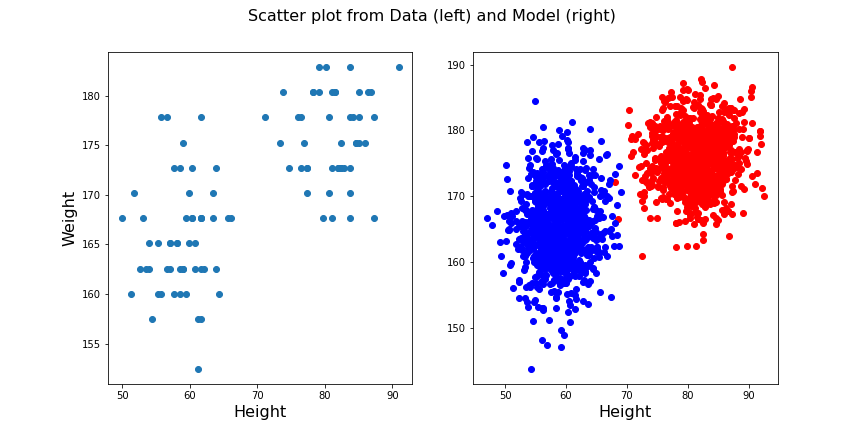
Exercises
End of chapter Exercises
Create the training and prediction workflow as above for a data set with two other features, namely: Diastole and Systole values from the ‘patients_data.csv’ file.
Extract the Diastole and Systole columns.
Use the data to fit a Gaussian model with 2 components and create a state space contour plot of the negative log likelihood with scattered data superimposed.
Extract the model weights, the means of the two Gaussians and their corresponding covariance matrices.
Calculate the adjusted random score for the labels ‘gender’ and ‘smoker’ in the data to estimate whether these have som overlap with the model fit.
Compare the original scatter plot versus the model generated scatter plot. Use a total of 100 samples for the model generated data and distribute them according to the model weights.
Repeat the plot multiple times to see how the degree of overlap in the model output changes with each choice of samples from the fitted distribution.
Create corresponding histograms of the Diastolic and Systolic blood pressure values from data and model. Try to guess where the differences in appearance come from.
The data show systematic gaps in the histogram meaning that some values do not occur (integer values only). In contrast, the model data from the random number generator can take any value. Therefore the counts per bin are generally lower for the model.
Key Points
- The automated assignment of data points to distinct groups is called
clustering. - Gaussian Mixture Models (GMM) is one example of cluster analysis.
-
.fit,..score_samplesand.predictare some of the key methods in GMM clustering. -
adjusted_rand_scoremethod randomly assigns labels for prediction scoring.
Content from Clustering Images
Last updated on 2025-01-27 | Edit this page
Download Chapter notebook (ipynb)
Mandatory Lesson Feedback Survey
Overview
Questions
- What makes image data unique for machine learning?
- How can MR images be clustered and segmented?
- How can segmentation be improved?
- How do we visualise clustered image data?
Objectives
- Learning to work with a domain-specific Python package.
- Clustering with Gaussian Mixture Models (GMM) to segment a medical image.
- Combining information from different imaging modalities for improved segmentation.
- Understanding strategies to visualise clustered output.
Prerequisite
Concept
Image Segmentation with Clustering
Medical imaging techniques are a valuable tool for probing diseases and disorders non-invasively. Processing medical images often consists of an expert, such as a radiologist, looking at the images and identifying, labelling and characterising potential lesions. This process can be time-consuming and reliant on a well-trained expert’s eye. To make medical imaging techniques feasible in circumstances where there may be insufficient time or resources for expert labelling, there is current research into using artificial intelligence to label images. There are many supervised learning techniques that utilise previously labelled data from experts to train a computer algorithm to recognise certain features of an image. However, this may require large amounts of data that were previously labelled, which again is not always available. An alternative approach is to use unsupervised learning strategies, such as clustering, to group images into different regions. The interpretation of these regions may be ambiguous, but with some previous knowledge, we may still use it to infer information from an image.
Medical Image Example
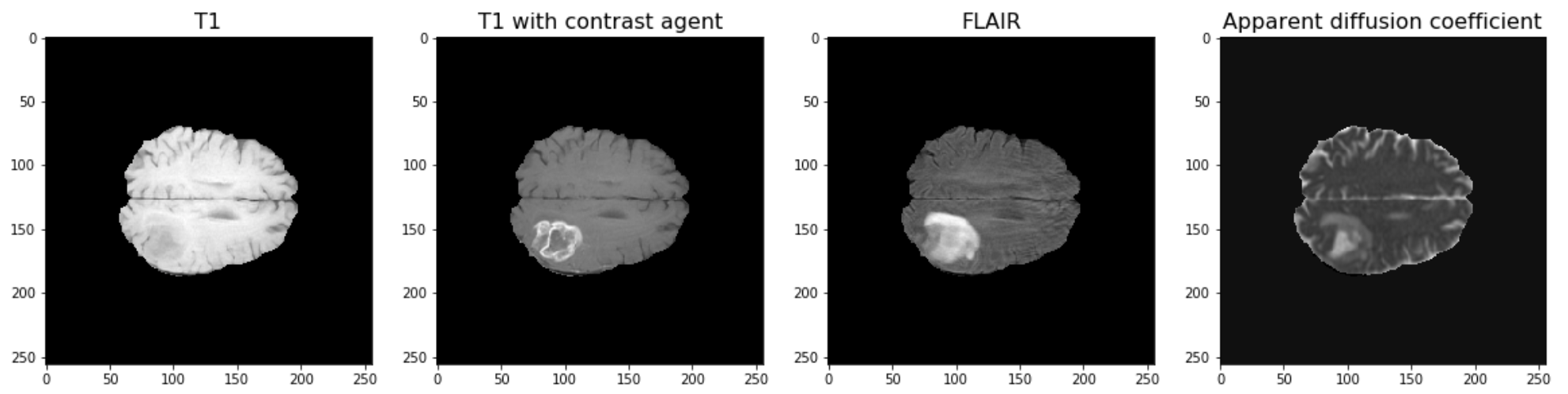
The example used in this lesson is part of the National Cancer Institute’s Clinical Proteomic Tumor Analysis Consortium Glioblastoma Multiforme (CPTAC-GBM) cohort and is available at The Cancer Imaging Archive: https://wiki.cancerimagingarchive.net/display/Public/CPTAC-GBM. For each subject in this study, several different brain MRI scans were performed, each of which gives different contrast in the brain. Each subject has been diagnosed with glioblastoma, and a tumour is visible in the MRI scans. To analyse the images and to, for example, estimate the size of the tumour, we may wish to segment the brain into healthy tissue and tumour tissue. The figure below shows four images in the different modalities.
Work Through Example
Code Preparation
We first import the modules needed for this lesson. We use Numpy to store and process images and we use nibabel to read the MRI images, which have a file type called ‘nifti’. Nibabel is freely available for download here: https://nipy.org/nibabel/
PYTHON
from numpy import zeros, sum, stack
import nibabel as nib
from matplotlib.pyplot import subplots, tight_layout, show
Note
Note how we import the nibabel package as ‘nib’. You can use any abbreviation to access the package’s functions from within your programme.
To familiarise yourself with the nibabel package, try the Getting started tutorial using an example image file.
Reading Images into Numpy Arrays
Next, we want to use the nibabel package to read the MRI images into Numpy arrays. In this example, we use four different images that were acquired with different MRI protocols.
PYTHON
img_3d = nib.load('fig/t1.nii')
img1 = img_3d.get_fdata()

img_3d = nib.load('fig/t1_contrast.nii')
img2 = img_3d.get_fdata()

img_3d = nib.load('fig/flair.nii')
img3 = img_3d.get_fdata()

img_3d = nib.load('fig/adc.nii')
img4 = img_3d.get_fdata()
Let’s have a look at the data shape:
(256, 256, 32)For plotting, we select a slice from the images. In this example we will view axial slices, i.e. slices from the last dimension. Thus, we choose a slice number between 0 and 31, here we go with slice 20 and plot it.
PYTHON
fig, ax = subplots(nrows=1, ncols=4, figsize=(20, 10))

ax[0].imshow(img1[:, :, img_slice], cmap='gray')
ax[0].set_title("T1", fontsize=16)
ax[1].imshow(img2[:, :, img_slice], cmap='gray')
ax[1].set_title("T1 with contrast agent", fontsize=16)
ax[2].imshow(img3[:, :, img_slice], cmap='gray')
ax[2].set_title("FLAIR", fontsize=16)
ax[3].imshow(img4[:, :, img_slice], cmap='gray')
ax[3].set_title("Apparent diffusion coefficient", fontsize=16);

show()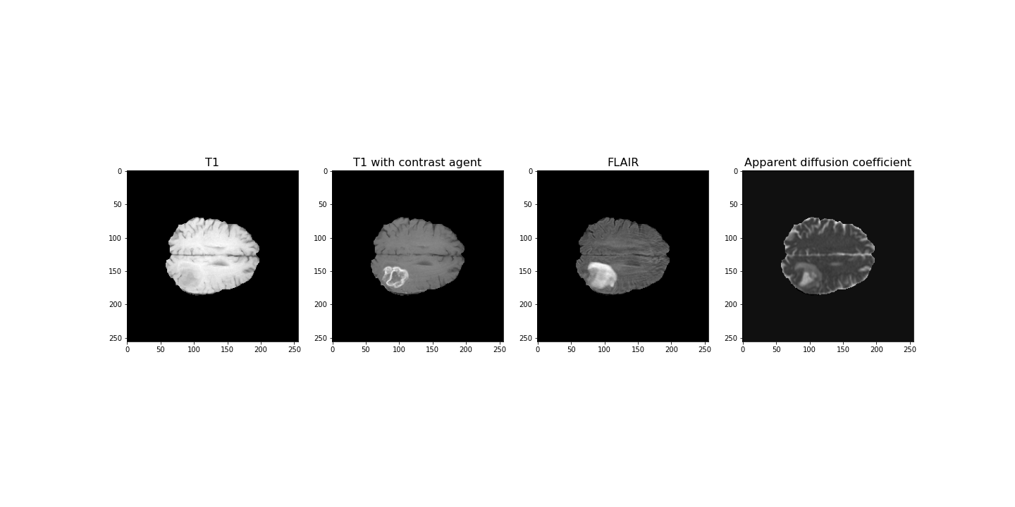
Data Pre-processing
To analyse the images, we need to do a bit of pre-processing. First of all, let us plot the histogram of the voxel (volume pixel) intensities.
PYTHON
fig, ax = subplots(nrows=1, ncols=4, figsize=(20, 4))

ax[0].hist(img1.flatten(), bins=50);
ax[0].set_title("T1", fontsize=16)
ax[0].set_xlabel("Intensity", fontsize=16)

ax[1].hist(img2.flatten(), bins=50);
ax[1].set_title("T1 with contrast agent", fontsize=16)
ax[1].set_xlabel("Intensity", fontsize=16)

ax[2].hist(img3.flatten(), bins=50);
ax[2].set_title("FLAIR", fontsize=16)
ax[2].set_xlabel("Intensity", fontsize=16)

ax[3].hist(img4.flatten(), bins=50);
ax[3].set_title("Apparent diffusion coefficient", fontsize=16)
ax[3].set_xlabel("Intensity", fontsize=16)

tight_layout()

print('Number of voxels with intensity equal to 0 is: %d'%sum(img1==0))
print('')

show()
OUTPUT
Number of voxels with intensity equal to 0 is: 1848804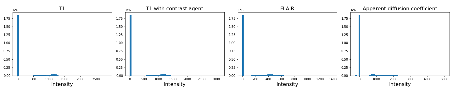
As we can see from these histograms, a large number of the values are zero. This corresponds to the background voxels shown in black. We want to remove these voxels, as they are not useful for our analysis. For this, we create a binary mask and apply it to the images.
Note
Note the use of tight_layout in the cell above. It is a
Matplotlib
function to pad between the figure edge and the edges of subplots.
This can be useful to avoid overlap of figures and labels. The keyword
parameter pad is set to 1.08 by default.
PYTHON
mask = (img1>0) & (img2>0) & (img3>0) & (img4>0)

img1_nz = img1[mask]
img2_nz = img2[mask]
img3_nz = img3[mask]
img4_nz = img4[mask]
With the mask applied, let us plot the histograms of the non-zero voxels again:
PYTHON
fig, ax = subplots(1, 4, figsize=(20, 4))

ax[0].hist(img1_nz, bins=50);
ax[0].set_title("T1", fontsize=16)
ax[0].set_xlabel("Intensity", fontsize=16)

ax[1].hist(img2_nz, bins=50);
ax[1].set_title("T1 with contrast agent", fontsize=16)
ax[1].set_xlabel("Intensity", fontsize=16)

ax[2].hist(img3_nz, bins=50);
ax[2].set_title("FLAIR", fontsize=16)
ax[2].set_xlabel("Intensity", fontsize=16)

ax[3].hist(img4_nz, bins=50);
ax[3].set_title("Apparent diffusion coefficient", fontsize=16)
ax[3].set_xlabel("Intensity", fontsize=16)

tight_layout()

show()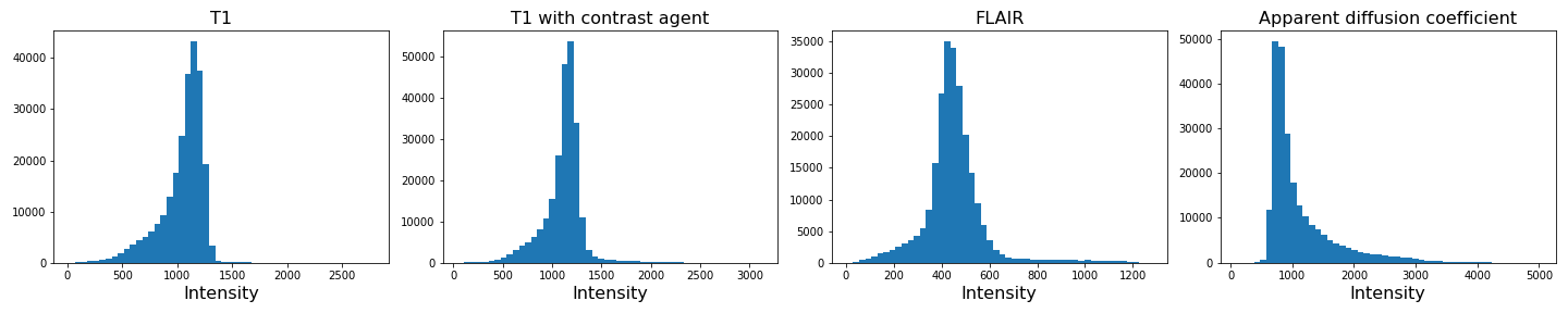
We can see that the data is no longer confounded by the zero-valued background voxels. The distribution of relevant intensities now becomes apparent.
Image scaling
In many machine learning applications (both supervised and unsupervised)
an additional step of data preparation consists in normalising or
scaling, i.e. adjustment of the values under certain conditions. For
example, the numbers in a data file are all positive and very large but
the algorithms work best for numbers with mean zero and variance 1. In
Scikit-learn this can be done by using fit_transform for an
instance of the StandardScaler.
PYTHON
from sklearn.preprocessing import StandardScaler

scaler = StandardScaler()

img1_scaled = scaler.fit_transform(img1_nz.reshape(-1, 1))
img2_scaled = scaler.fit_transform(img2_nz.reshape(-1, 1))
img3_scaled = scaler.fit_transform(img3_nz.reshape(-1, 1))
img4_scaled = scaler.fit_transform(img4_nz.reshape(-1, 1))

fig, ax = subplots(1, 4, figsize=(20, 4))

ax[0].hist(img1_scaled, bins=50);
ax[0].set_title("T1", fontsize=16)
ax[0].set_xlabel("Intensity", fontsize=16)

ax[1].hist(img2_scaled, bins=50);
ax[1].set_title("T1 with contrast agent", fontsize=16)
ax[1].set_xlabel("Intensity", fontsize=16)

ax[2].hist(img3_scaled, bins=50);
ax[2].set_title("FLAIR", fontsize=16)
ax[2].set_xlabel("Intensity", fontsize=16)

ax[3].hist(img4_scaled, bins=50);
ax[3].set_title("Apparent diffusion coefficient", fontsize=16)
ax[3].set_xlabel("Intensity", fontsize=16)

tight_layout()

show()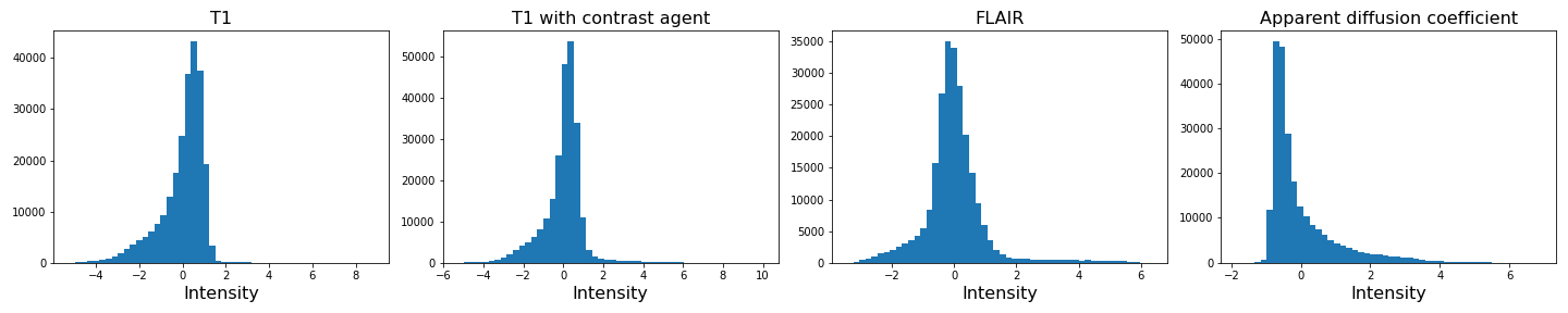
If you compare the histograms, you can see that the values in the data have changed (horizontal axis) but the shapes of the distributions are the same.
We are not pursuing this further here but you are encouraged to re-do the clustering below with the scaled images and check if there are any differences.
Image Segmentation with Clustering
After this data cleaning step, we can proceed with our analysis. We want to segment the images into brain tissue and tumour tissue. It is not obvious how to do this, as the intensity values in the above histogram are continuous with only one major peak in intensity. We will nonetheless attempt to cluster the images using a Gaussian Mixture Model (GMM).
First, we import the GMM class from Scikit-learn.
We then fit the instantiated model with a few different numbers of
clusters (argument n_components, between n = 2-4)
individually for each image. We use the fit_predict method
to simultaneously fit and label the images. Note that we also add 1 to
each image label. This is because each data point gets labelled with a
number from 0 to n-1 where n is the number of clusters
used to fit the model. At the plotting stage, we do not want any of our
labels to be equal to 0, as this corresponds to the background.
PYTHON
RANDOM_SEED = 123

gmm_2 = gmm_2 = GaussianMixture(2, random_state=RANDOM_SEED)
img1_n2_labels = gmm_2.fit_predict(img1_nz.reshape(-1, 1))
img1_n2_labels += 1

gmm_3 = GaussianMixture(3, random_state=RANDOM_SEED)
img1_n3_labels = gmm_3.fit_predict(img1_nz.reshape(-1, 1))
img1_n3_labels += 1

gmm_4 = GaussianMixture(4, random_state=RANDOM_SEED)
img1_n4_labels = gmm_4.fit_predict(img1_nz.reshape(-1, 1))
img1_n4_labels += 1
PYTHON
gmm_2 = GaussianMixture(2, random_state=RANDOM_SEED)
img2_n2_labels = gmm_2.fit_predict(img2_nz.reshape(-1, 1))
img2_n2_labels += 1

gmm_3 = GaussianMixture(3, random_state=RANDOM_SEED)
img2_n3_labels = gmm_3.fit_predict(img2_nz.reshape(-1, 1))
img2_n3_labels += 1

gmm_4 = GaussianMixture(4, random_state=RANDOM_SEED)
img2_n4_labels = gmm_4.fit_predict(img2_nz.reshape(-1, 1))
img2_n4_labels += 1
PYTHON
gmm_2 = GaussianMixture(2, random_state=RANDOM_SEED)
img3_n2_labels = gmm_2.fit_predict(img3_nz.reshape(-1, 1))
img3_n2_labels += 1

gmm_3 = GaussianMixture(3, random_state=RANDOM_SEED)
img3_n3_labels = gmm_3.fit_predict(img3_nz.reshape(-1, 1))
img3_n3_labels += 1

gmm_4 = GaussianMixture(4, random_state=RANDOM_SEED)
img3_n4_labels = gmm_4.fit_predict(img3_nz.reshape(-1, 1))
img3_n4_labels += 1
PYTHON
gmm_2 = GaussianMixture(2, random_state=RANDOM_SEED)
img4_n2_labels = gmm_2.fit_predict(img4_nz.reshape(-1, 1))
img4_n2_labels += 1

gmm_3 = GaussianMixture(3, random_state=RANDOM_SEED)
img4_n3_labels = gmm_3.fit_predict(img4_nz.reshape(-1, 1))
img4_n3_labels += 1

gmm_4 = GaussianMixture(4, random_state=RANDOM_SEED)
img4_n4_labels = gmm_4.fit_predict(img4_nz.reshape(-1, 1))
img4_n4_labels += 1
Once we have all our image labels, we map the labels back to the two-dimensional image array and plot the result.
PYTHON
img1_n2_labels_mapped = zeros(img1.shape)
img1_n2_labels_mapped[mask] = img1_n2_labels

img1_n3_labels_mapped = zeros(img1.shape)
img1_n3_labels_mapped[mask] = img1_n3_labels

img1_n4_labels_mapped = zeros(img1.shape)
img1_n4_labels_mapped[mask] = img1_n4_labels
PYTHON
img2_n2_labels_mapped = zeros(img2.shape)
img2_n2_labels_mapped[mask] = img2_n2_labels

img2_n3_labels_mapped = zeros(img2.shape)
img2_n3_labels_mapped[mask] = img2_n3_labels

img2_n4_labels_mapped = zeros(img2.shape)
img2_n4_labels_mapped[mask] = img2_n4_labels
PYTHON
img3_n2_labels_mapped = zeros(img3.shape)
img3_n2_labels_mapped[mask] = img3_n2_labels

img3_n3_labels_mapped = zeros(img3.shape)
img3_n3_labels_mapped[mask] = img3_n3_labels

img3_n4_labels_mapped = zeros(img3.shape)
img3_n4_labels_mapped[mask] = img3_n4_labels
PYTHON
img4_n2_labels_mapped = zeros(img4.shape)
img4_n2_labels_mapped[mask] = img4_n2_labels

img4_n3_labels_mapped = zeros(img4.shape)
img4_n3_labels_mapped[mask] = img4_n3_labels

img4_n4_labels_mapped = zeros(img4.shape)
img4_n4_labels_mapped[mask] = img4_n4_labels
PYTHON
fig, ax = subplots(3, 4, figsize=(20, 15))

ax[0, 0].imshow(img1_n2_labels_mapped[:, :, img_slice], cmap='viridis')
ax[1, 0].imshow(img1_n3_labels_mapped[:, :, img_slice], cmap='viridis')
ax[2, 0].imshow(img1_n4_labels_mapped[:, :, img_slice], cmap='viridis')
ax[0, 1].imshow(img2_n2_labels_mapped[:, :, img_slice], cmap='viridis')
ax[1, 1].imshow(img2_n3_labels_mapped[:, :, img_slice], cmap='viridis')
ax[2, 1].imshow(img2_n4_labels_mapped[:, :, img_slice], cmap='viridis')

ax[0, 2].imshow(img3_n2_labels_mapped[:, :, img_slice], cmap='viridis')
ax[1, 2].imshow(img3_n3_labels_mapped[:, :, img_slice], cmap='viridis')
ax[2, 2].imshow(img3_n4_labels_mapped[:, :, img_slice], cmap='viridis')

ax[0, 3].imshow(img4_n2_labels_mapped[:, :, img_slice], cmap='viridis')
ax[1, 3].imshow(img4_n3_labels_mapped[:, :, img_slice], cmap='viridis')
ax[2, 3].imshow(img4_n4_labels_mapped[:, :, img_slice], cmap='viridis')

ax[0, 0].set_ylabel("2 clusters", fontsize=18)
ax[1, 0].set_ylabel("3 clusters", fontsize=18)
ax[2, 0].set_ylabel("4 clusters", fontsize=18)

ax[0, 0].set_title("Image 1", fontsize=18)
ax[0, 1].set_title("Image 2", fontsize=18)
ax[0, 2].set_title("Image 3", fontsize=18)
ax[0, 3].set_title("Image 4", fontsize=18)

tight_layout()

show()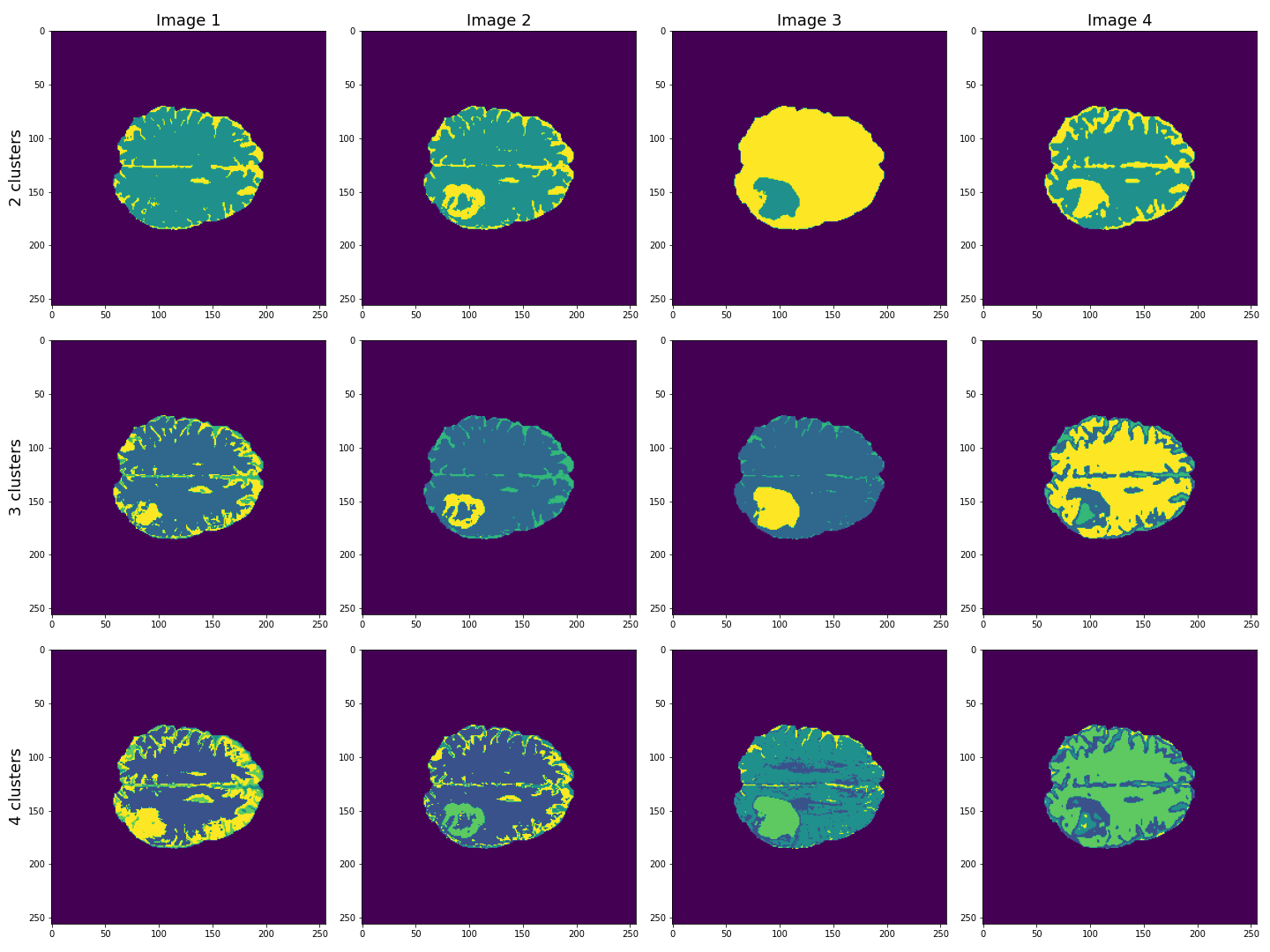
This figure shows the labels acquired from each of the images, using different numbers of clusters. We see that using Image 3 (acquired with FLAIR protocol), the lesion is segmented quite well from the rest of the brain. The other images are less effective at clearly identifying the lesion. However, some of these images, e.g. Image 4 (apparent diffusion coefficient) performs better at segmenting brain tissue from surrounding cerebrospinal fluid (CSF). CSF is not part of brain tissue and can contaminate our results. Ideally, we want to segment three key areas: brain, lesion and CSF.
Combining Contrast from Different Images
So far, we only used the intensities of each image individually, i.e. using only one feature. We now try to combine the images into a single Numpy array containing four columns, one for each image.
(240391, 4)
PYTHON
gmm_3 = GaussianMixture(3, random_state=RANDOM_SEED)

all_img_n3_labels = gmm_3.fit_predict(all_img)
all_img_n3_labels += 1
PYTHON
all_img_n3_labels_mapped = zeros(img1.shape)
all_img_n3_labels_mapped[mask] = all_img_n3_labels
PYTHON
fig, ax = subplots(1, 5, figsize=(20, 5))
ax[0].imshow(img1_n3_labels_mapped[:, :, img_slice], cmap='viridis')
ax[1].imshow(img2_n3_labels_mapped[:, :, img_slice], cmap='viridis')
ax[2].imshow(img3_n3_labels_mapped[:, :, img_slice], cmap='viridis')
ax[3].imshow(img4_n3_labels_mapped[:, :, img_slice], cmap='viridis')
ax[4].imshow(all_img_n3_labels_mapped[:, :, img_slice], cmap='viridis')

ax[0].set_ylabel("3 clusters", fontsize=18)

ax[0].set_title("Image 1", fontsize=18)
ax[1].set_title("Image 2", fontsize=18)
ax[2].set_title("Image 3", fontsize=18)
ax[3].set_title("Image 4", fontsize=18)
ax[4].set_title("All images", fontsize=18)

tight_layout()

show()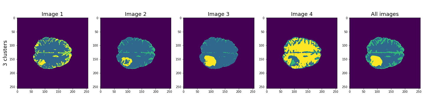
Here, the last column shows the cluster results when all four images are used in the Gaussian mixture model. These results seem to be better than the individual images, and with three clusters, the lesion, CSF and brain tissue seem clearly identified.
Let’s plot some of the other image slices to check that the segmentation performs well on the whole 3D image.
PYTHON
fig, ax = subplots(5, 5, figsize=(20, 20))

ax[0, 0].imshow(img1[:, :, 16], cmap='gray')
ax[0, 1].imshow(img1[:, :, 18], cmap='gray')
ax[0, 2].imshow(img1[:, :, 20], cmap='gray')
ax[0, 3].imshow(img1[:, :, 22], cmap='gray')
ax[0, 4].imshow(img1[:, :, 24], cmap='gray')

ax[1, 0].imshow(img2[:, :, 16], cmap='gray')
ax[1, 1].imshow(img2[:, :, 18], cmap='gray')
ax[1, 2].imshow(img2[:, :, 20], cmap='gray')
ax[1, 3].imshow(img2[:, :, 22], cmap='gray')
ax[1, 4].imshow(img2[:, :, 24], cmap='gray')

ax[2, 0].imshow(img3[:, :, 16], cmap='gray')
ax[2, 1].imshow(img3[:, :, 18], cmap='gray')
ax[2, 2].imshow(img3[:, :, 20], cmap='gray')
ax[2, 3].imshow(img3[:, :, 22], cmap='gray')
ax[2, 4].imshow(img3[:, :, 24], cmap='gray')

ax[3, 0].imshow(img4[:, :, 16], cmap='gray')
ax[3, 1].imshow(img4[:, :, 18], cmap='gray')
ax[3, 2].imshow(img4[:, :, 20], cmap='gray')
ax[3, 3].imshow(img4[:, :, 22], cmap='gray')
ax[3, 4].imshow(img4[:, :, 24], cmap='gray')

ax[4, 0].imshow(all_img_n3_labels_mapped[:, :, 16], cmap='viridis')
ax[4, 1].imshow(all_img_n3_labels_mapped[:, :, 18], cmap='viridis')
ax[4, 2].imshow(all_img_n3_labels_mapped[:, :, 20], cmap='viridis')
ax[4, 3].imshow(all_img_n3_labels_mapped[:, :, 22], cmap='viridis')
ax[4, 4].imshow(all_img_n3_labels_mapped[:, :, 24], cmap='viridis')

ax[0, 0].set_title("Slice 16", fontsize=16)
ax[0, 1].set_title("Slice 18", fontsize=16)
ax[0, 2].set_title("Slice 20", fontsize=16)
ax[0, 3].set_title("Slice 22", fontsize=16)
ax[0, 4].set_title("Slice 24", fontsize=16)

ax[0, 0].set_ylabel("Image 1", fontsize=16)
ax[1, 0].set_ylabel("Image 2", fontsize=16)
ax[2, 0].set_ylabel("Image 3", fontsize=16)
ax[3, 0].set_ylabel("Image 4", fontsize=16)
ax[4, 0].set_ylabel("Clustered labels", fontsize=16);

show()
Overall, the lesion, shown in yellow, seems to be segmented well across the volume.
Checking the GMM Labels
To investigate how the image intensities were clustered, we can look at the scatter plots for each combination of images. The diagonal plots show histograms of each image. This type of plot can be very useful in exploratory data analysis.
Note
Note that this plot might take a bit longer to run, as there are a very large number of data points.
In a python plotting library called seaborn, such plots are called
pairplots and can be very easily plotted if your data is in
a pandas dataframe.
You can install it at the command prompt (Windows) or terminal (MacOS, Linux) using:
conda install seabornTo use it, import the required functions in your Python kernel, e.g.:
ModuleNotFoundError: No module named ‘seaborn’
We don’t use this library here, but encourage you to look up further information in the seaborn documentation.
PYTHON
fig, ax = subplots(4, 4, figsize=(20, 20))

ax[0, 0].hist(img1_nz, bins=50);
ax[0, 0].set_title('Image 1', fontsize=16)
ax[0, 1].scatter(img1_nz, img2_nz, c=all_img_n3_labels, cmap='viridis', vmin=0);
ax[0, 1].set_xlabel('Image 1', fontsize=16)
ax[0, 1].set_ylabel('Image 2', fontsize=16)
ax[0, 2].scatter(img1_nz, img3_nz, c=all_img_n3_labels, cmap='viridis', vmin=0);
ax[0, 2].set_xlabel('Image 1', fontsize=16)
ax[0, 2].set_ylabel('Image 3', fontsize=16)
ax[0, 3].scatter(img1_nz, img4_nz, c=all_img_n3_labels, cmap='viridis', vmin=0);
ax[0, 3].set_xlabel('Image 1', fontsize=16)
ax[0, 3].set_ylabel('Image 4', fontsize=16)

ax[1, 0].scatter(img2_nz, img1_nz, c=all_img_n3_labels, cmap='viridis', vmin=0);
ax[1, 0].set_xlabel('Image 2', fontsize=16)
ax[1, 0].set_ylabel('Image 1', fontsize=16)
ax[1, 1].hist(img2_nz, bins=50);
ax[1, 1].set_title('Image 2', fontsize=16)
ax[1, 2].scatter(img2_nz, img3_nz, c=all_img_n3_labels, cmap='viridis', vmin=0);
ax[1, 2].set_xlabel('Image 2', fontsize=16)
ax[1, 2].set_ylabel('Image 3', fontsize=16)
ax[1, 3].scatter(img2_nz, img4_nz, c=all_img_n3_labels, cmap='viridis', vmin=0);
ax[1, 3].set_xlabel('Image 2', fontsize=16)
ax[1, 3].set_ylabel('Image 4', fontsize=16)

ax[2, 0].scatter(img3_nz, img1_nz, c=all_img_n3_labels, cmap='viridis', vmin=0);
ax[2, 0].set_xlabel('Image 3', fontsize=16)
ax[2, 0].set_ylabel('Image 1', fontsize=16)
ax[2, 1].scatter(img3_nz, img2_nz, c=all_img_n3_labels, cmap='viridis', vmin=0);
ax[2, 1].set_xlabel('Image 3', fontsize=16)
ax[2, 1].set_ylabel('Image 2', fontsize=16)
ax[2, 2].hist(img3_nz, bins=50);
ax[2, 2].set_title('Image 3', fontsize=16)
ax[2, 3].scatter(img3_nz, img4_nz, c=all_img_n3_labels, cmap='viridis', vmin=0);
ax[2, 3].set_xlabel('Image 3', fontsize=16)
ax[2, 3].set_ylabel('Image 4', fontsize=16)

ax[3, 0].scatter(img4_nz, img1_nz, c=all_img_n3_labels, cmap='viridis', vmin=0);
ax[3, 0].set_xlabel('Image 4', fontsize=16)
ax[3, 0].set_ylabel('Image 1', fontsize=16)
ax[3, 1].scatter(img4_nz, img2_nz, c=all_img_n3_labels, cmap='viridis', vmin=0);
ax[3, 1].set_xlabel('Image 4', fontsize=16)
ax[3, 1].set_ylabel('Image 2', fontsize=16)
ax[3, 2].scatter(img4_nz, img3_nz, c=all_img_n3_labels, cmap='viridis', vmin=0);
ax[3, 2].set_xlabel('Image 4', fontsize=16)
ax[3, 2].set_ylabel('Image 3', fontsize=16)
ax[3, 3].hist(img4_nz, bins=50);
ax[3, 3].set_title('Image 4', fontsize=16)

fig.tight_layout()
show()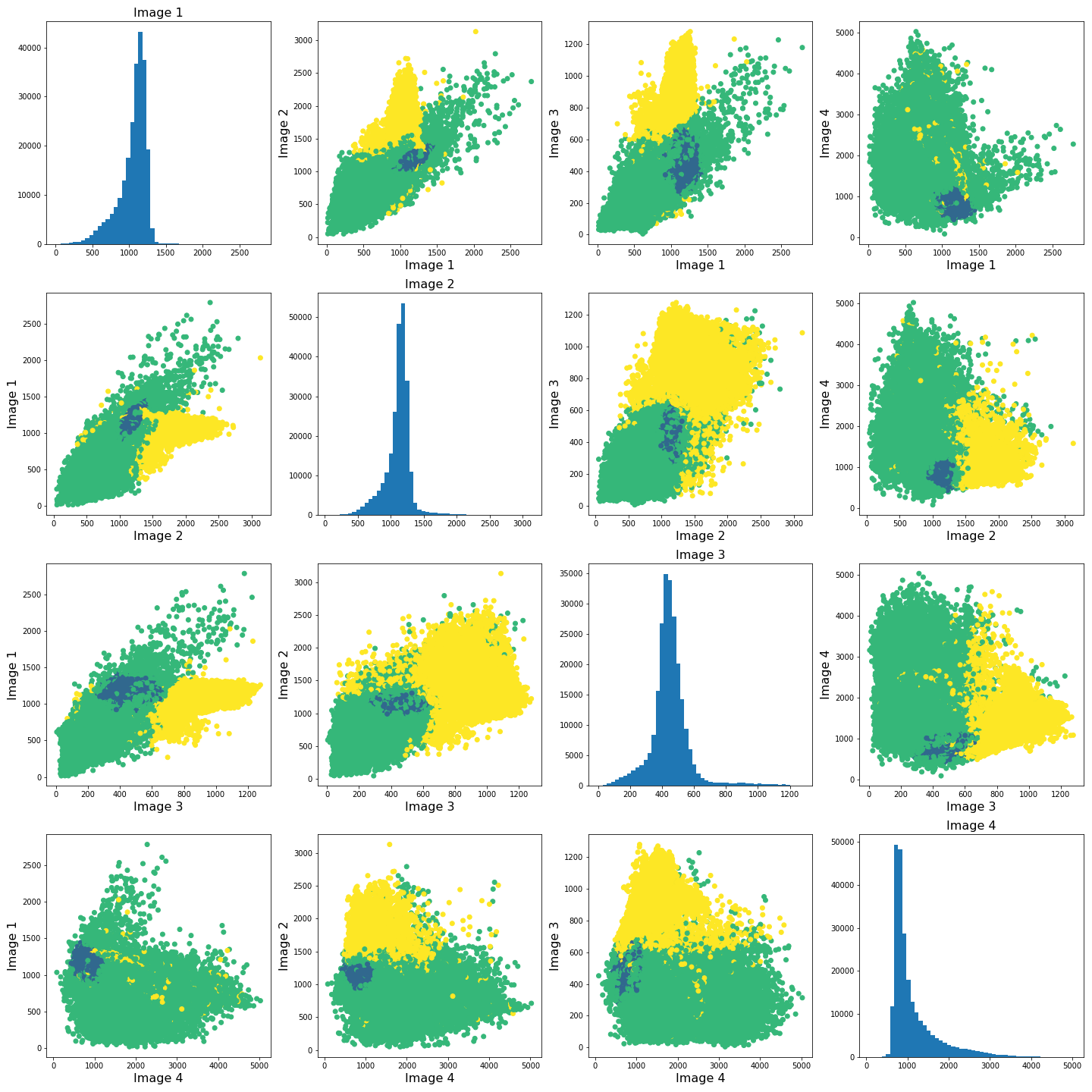
The colours in the scatter plots above correspond to the labels we extracted using all four images and three clusters. I.e. green corresponds to healthy brain tissue, yellow corresponds to CSF and blue corresponds to the lesion. This figure shows reasonably well how CSF (yellow) and lesion (blue) can be clustered. However, it is not as easy to see how the healthy tissue was separated from CSF and lesion tissue. To investigate further, we can plot the above slightly differently, using a 2-dimensional histogram instead of a scatter plot.
A 2-dimensional histogram plots the counts of values in bins for two
variables. The results are displayed as a heatmap. An intuitive example
with code using the Matplotlib function hist2d is
available here.|
PYTHON
import matplotlib.colors as mcolors

fig, ax = subplots(4, 4, figsize=(20, 20))

ax[0, 0].hist(img1_nz, bins=50);
ax[0, 1].hist2d(img1_nz, img2_nz, bins=100, norm=mcolors.PowerNorm(0.2));
ax[0, 2].hist2d(img1_nz, img3_nz, bins=100, norm=mcolors.PowerNorm(0.2));
ax[0, 3].hist2d(img1_nz, img4_nz, bins=100, norm=mcolors.PowerNorm(0.2));

ax[1, 0].hist2d(img2_nz, img1_nz, bins=100, norm=mcolors.PowerNorm(0.2));
ax[1, 1].hist(img2_nz, bins=50);
ax[1, 2].hist2d(img2_nz, img3_nz, bins=100, norm=mcolors.PowerNorm(0.2));
ax[1, 3].hist2d(img2_nz, img4_nz, bins=100, norm=mcolors.PowerNorm(0.2));

ax[2, 0].hist2d(img3_nz, img1_nz, bins=100, norm=mcolors.PowerNorm(0.2));
ax[2, 1].hist2d(img3_nz, img2_nz, bins=100, norm=mcolors.PowerNorm(0.2));
ax[2, 2].hist(img3_nz, bins=50);
ax[2, 3].hist2d(img3_nz, img4_nz, bins=100, norm=mcolors.PowerNorm(0.2));

ax[3, 0].hist2d(img4_nz, img1_nz, bins=100, norm=mcolors.PowerNorm(0.2));
ax[3, 1].hist2d(img4_nz, img2_nz, bins=100, norm=mcolors.PowerNorm(0.2));
ax[3, 2].hist2d(img4_nz, img3_nz, bins=100, norm=mcolors.PowerNorm(0.2));
ax[3, 3].hist(img4_nz, bins=50);

show()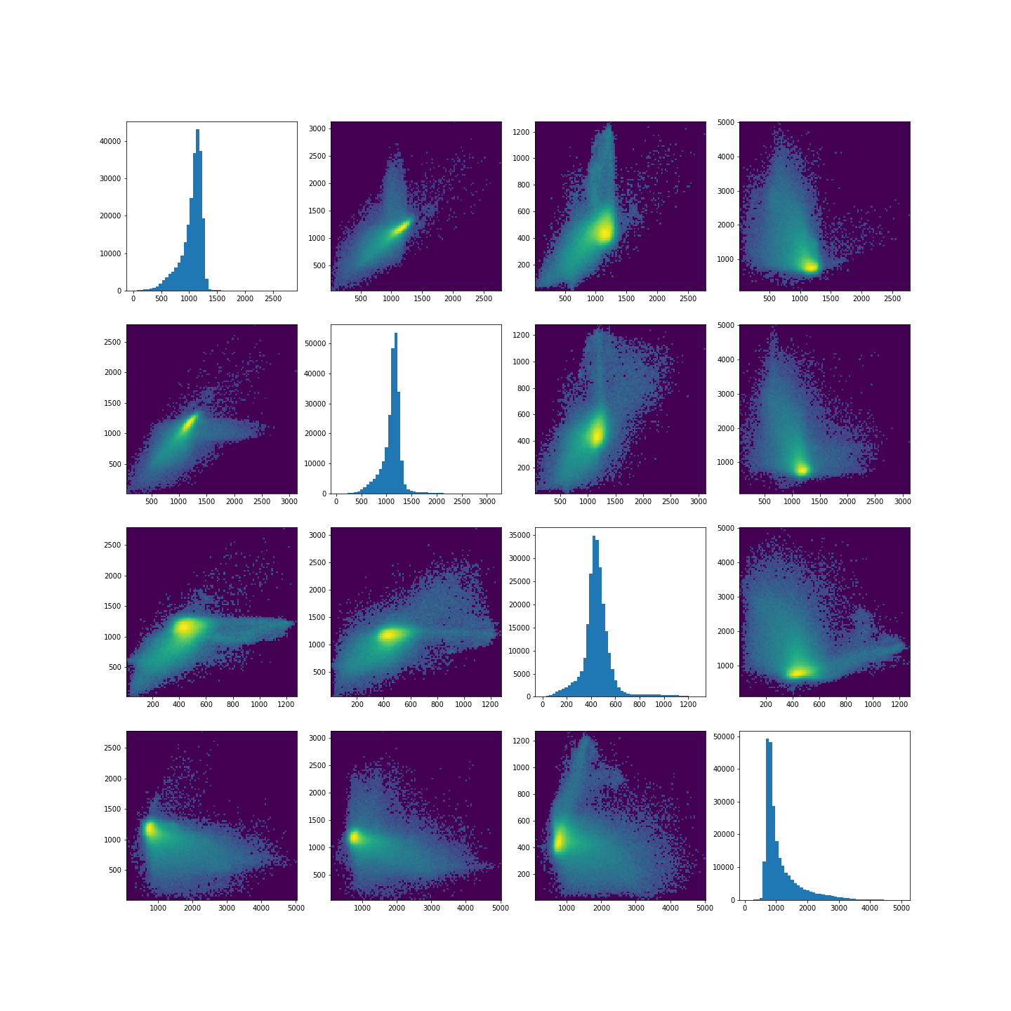
Note in the plot, we used a PowerNorm normalisation on the image intensities. This is just to aid with visualisation, and you are welcome to change or completely remove the normalisation.
The plots show that there is a bright, high-density region corresponding to the clustered healthy tissue region. This gives us a better idea how the GMM algorithm found the three regions. Healthy tissue has low signal variance in all 4 images. Signal intensity in CSF and the lesion have much higher variance making it possible to distinguish them from healthy tissue. Furthermore, the relative intensities of CSF and lesion tissue are different as shown in the scatter plots, making it possible for the GMM to distinguish between the two.
Exercises
End of chapter Exercises
In this assignment, we ask you to use the same set of images as in the work through example. However, instead of GMM, we want you to try a different clustering method called KMeans. The documentation for KMneans is available here: https://scikit-learn.org/stable/modules/generated/sklearn.cluster.KMeans.html. Some examples of how kmeans clustering can go wrong are shown in this example code.
Using KMeans from ‘sklearn.cluster’, do the following
tasks:
Investigate different numbers of clusters, similarly to what we did in th work through example.
Use different combinations of the 4 images to see how the clustering performs in different cases.
The labelled results using all four images may not look as clean as the ones in the work-through example. Try scaling the images e.g. using the sklearn standard scaler, and combining the scaled images. Do the results change? If yes, explore and comment on why you think scaling may be advantageous in this clustering example.
Compare the behaviour of
KMeansto the outcome withGaussianMixture.
Further Reading
If after this lesson you want to deepen your understanding of clustering and, in particular, want to compare the performance of different clustering methods when dealing with images, try the article Clustering techniques for neuroimaging applications. It is paywalled and you will need an institutional access to download.
Key Points
- Image analysis almost always requires a bit of pre-processing.
- Image scaling is performed by using
fit_transformmethod from moduleStandardScalerinScikit-learn. - GMM offers a good startig point in image clustering.
- Diagonal plots are very useful in exploratory data analysis.
Content from Dimensionality Reduction
Last updated on 2025-01-27 | Edit this page
Download Chapter notebook (ipynb)
Mandatory Lesson Feedback Survey
Overview
Questions
- Why is it important to perform dimensionality reduction?
- How is dimensionality reduction performed?
- How PCA is used to determine variance?
- When does PCA fail?
Objectives
- Understanding high-dimensional datasets.
- Applying dimensionality reduction to extract features.
- Learning to use PCA for dimensionality reduction.
- Estimating the optimal number of features.
Prerequisite
Code Preparation
PYTHON
from numpy import reshape, append, mean, pi, linspace, var, array, cumsum, arange
from numpy.random import seed, multivariate_normal, binomial
from numpy.linalg import norm

from math import cos, sin, atan2
from matplotlib.pyplot import subplots, xlabel, ylabel, scatter, title
from matplotlib.pyplot import figure, plot, xticks, xlabel, ylabel, suptitle, show

import glob
from pathlib import Path
from pandas import read_csv, DataFrame
import csv
Introduction
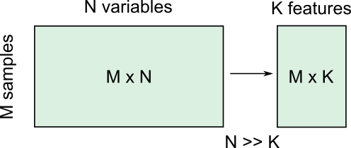
Clinical and scientific datasets often contain measurements of many physiological variables, expression of many genes or metabolic markers. These datasets, where each individual observation/sample is described by many variables are referred to as high-dimensional. However, some of these features can be highly correlated or redundant, and we sometimes want a more condensed description of the data. This process of describing the data by a reduced number of new combined features that reduces redundancy, is called dimensionality reduction.
There are several reasons for performing dimensionality reduction, both for data exploration and for pre-processing:
Data compression, to optimize memory usage/loading speed and visualisation of “important features”.
To find the individual variable or combinations of variables that give a condensed but accurate description of the data (sometimes also called feature extraction).
It can also be used for “denoising” - removing features that only account for small variability.
It is also useful to perform this step before other supervised (regression, classification) or unsupervised learning procedures (like clustering), by reducing data to “main features” to improve robustness of learning, especially with a limited number of independent observations.
Example: Predicting outcome from large-scale genetic or molecular studies
Clinical research can involve doing an exhaustive measurement of all tentative diagnostic markers, for example levels of various cytokines and hormones, or searching for genetic markers of a disease. There is good reason to expect that these share regulatory/signalling mechanisms, and that their interaction determines disease outcome. Building a regression model including all measurements is problematic because of multicollinearity and the demand for a much larger number of observations.
By performing dimensionality reduction, we first find features that capture the major patterns of covariation of these factors in the sample population. Then we will use these compact features, rather than individual measurements, to train our classifier or regression model, to study outcomes. With fewer features, we train models with less data.
Loading example data: Childhood Onset Rheumatic Disease gene expression profile
Gene expression data (for selected markers) is available for 83 individuals, including some patients with varying forms of early-onset rheumatic disease (available at EMBL-Bioinformatics database, also included in folder). This is a typical example of high dimensional datasets, with transcript levels for >50,000 genes measured!
Here, the data are read from individual files in the ‘Dataset’ folder and combined into a Pandas dataframe called ‘geneData’.
PYTHON
# Load all data
nGenes = 1000 # keep only these genes for now

filectr=0

datapath = Path("data")    #/relative/path/to/folder/with/datsets

for txt in datapath.glob("*.txt"):
    b=read_csv(txt, sep='\t', usecols=[1])
    b=reshape(b.values, (1,54675)) # each file is 1 observation sample i.e. 1 row.
    if filectr==0:
        coln =  read_csv(txt, sep='\t', usecols=[0])
        a = b
    else:
        a=append( a, b, axis=0)
    filectr+=1

# convert 2D array to dataframe
geneData = DataFrame( data=a[:,range(nGenes)]- mean(a[:,range(nGenes)], axis=0), columns = coln.values[range(nGenes)])Apart from the large number of variables (compared to number of samples), we also have strongly correlated expression of various markers. We can see that by plotting the correlation matrix of the dataframe.
PYTHON
fig, ax = subplots(figsize=(8,8))
im = ax.matshow(geneData.corr())
cbar = fig.colorbar(im, shrink=0.82)
xlabel('Locus #', fontsize=14);
ylabel('Locus #', fontsize=14);

show()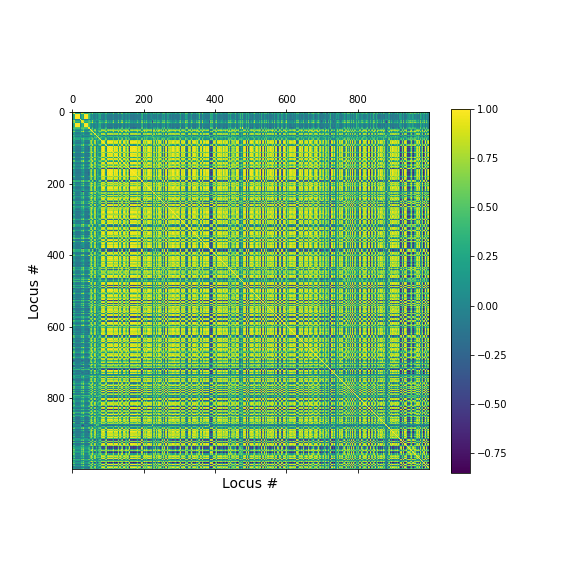
The little yellow blocks indicate that various features are strongly correlation (values around 1). Further analyses (e.g. checking if we find clusters mapping to healthy individuals and patients, respectively, or whether patients with different patterns of marker expression can be identified for future diagnostic purposes) can be thus be improved if we perform a dimensionality reduction, i.e. decrease the number of features while maintaining relevant information.
Principal Component Analysis
Principal component analysis (PCA) is one of the most commonly used dimensionality reduction methods. Instead of describing the data using the original measurements, it finds a new set of ranked features (the “basis”). The new “features” are linear combinations of the original variables, such that they are all orthogonal to each other, and the “importance” of a feature (called the principal component) is generally given by how much of the variability in the dataset it captures (the so-called explained variance). Thus, we first transform the data from the original variables into a new set of features or principal components (PCs).
To get a lower dimensional description of the data, we retain only the top features (PCs) such that the largest variations or ‘patterns’ in the dataset are preserved.
To apply PCA from Scikit-learn, we need to
specify the number of components (n_components) we want to
reduce the data to. n_components must be less than the
rank of the dataset, i.e. less than the smaller of the number
of samples and number of variables measured.
Simple example with 2D generated dataset
To first explore what dimensionality reduction with PCA looks like, we will work with a simple 2-dimensional (2D) dataset, where we want to find a 1D description instead.
We start with generating some observations from a two-dimensional (multivariate) Gaussian distribution, with mean and covariance specified.
PYTHON
RND_SEED = 7890
seed(RND_SEED)

# Set up 2D multivariate Gaussians
means = [20, 20]

cov_mat = [[1, .85], [.85, 1.5]] # 2x2 covariance matrix must be symmetric and positive-semidefinite(>=0)

# Generate data
nSamples = 300

data = multivariate_normal(means, cov_mat, nSamples)

print(data.shape)
(300, 2)
We can check the distribution of the two features in histograms, and we can see how the two data dimensions relate to each other in the scatter plot.
PYTHON
# Center data
zdata = data - mean(data, axis=0)

fig, ax = subplots(ncols=3, nrows=1, figsize=(15, 4))

ax[0].hist(zdata[:, 0]);
ax[0].set_title('Dim 1', fontsize=16, fontweight='bold');
ax[0].set_xlabel('Values', fontsize=14);
ax[0].set_ylabel('Frequency', fontsize=14);

ax[1].hist(zdata[:, 1]);
ax[1].set_title('Dim 2', fontsize=16, fontweight='bold');
ax[1].set_xlabel('Values', fontsize=14);


ax[2].scatter(zdata[:, 0], zdata[:, 1]);
ax[2].set_title('Sample Data', fontsize=16, fontweight='bold')
ax[2].set_xlabel('Dim 1', fontsize=14);
ax[2].set_ylabel('Dim 2', fontsize=14);

show()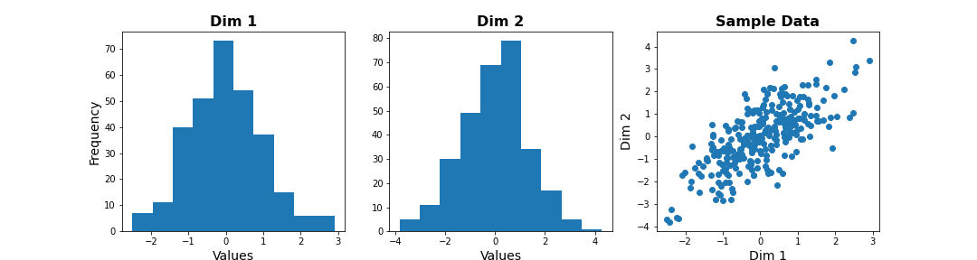
Note
The last plot, with the samples plotted as scatter in the space of measured variables is called a “state space plot”. The main axes correspond to individual variables.
Now if we want to represent data by a single feature, we can see that the individual variables are not ideal. If we only keep Dim 1, we lose substantial variability along Dim 2. We see that the data points are stretched along the main diagonal. This implies that the two variables co-vary to some extent. Thus, a linear combination of the two might capture this relevant pattern.
A linear combination corresponds to a vector (or direction) in this 2D state space.For example, the x-axis vector (1, 0) = [1 x Dim1 + 0 x Dim2], i.e. it contains Dim 1 only. More generally, (a, b) represents the linear combination [a x Dim1 + b x Dim2], i.e. a mixture of the two variables. Typically, we ensure that the length of these vectors is 1, to avoid artefactual rescaling of data.
PCA as projection or rotation of basis
Instead of representing data by their values along Dim 1 and Dim 2, we now try to describe them along different directions. We do so by projecting 2D data onto that vector. To quantify the importance of each direction, we measure the variance of the projected samples.
Let us examine different vectors that point at various angles compared to the x-axis. Remember that the vector denoted by the angle = ( cos(angle), sin(angle) ) denotes the following linear combination of the 2D sample d=[d1, d2]:
f(d1,d2) = cos(angle) * d1 + sin(angle) * d2
PYTHON
## Centre data at origin by subtracting mean
zdata = data - mean(data, axis=0)

# Define a feature as a direction in the 2D space using the angle
angle = pi/4

# Obtain the vector
vec = [cos(angle), sin(angle)] # has norm=1 by definition, otherwise:  vec = vec/norm(vec)

# Project 2D data onto this single dimension
dim1_data = zdata.dot(vec)


fig, ax = subplots(ncols=2, nrows=1, figsize=(15, 6))

# Plot data and the feature direction
ax[0].scatter(zdata[:, 0], zdata[:, 1]);
ax[0].quiver([0], [0], vec[0], vec[1], scale=3);

ax[0].set_title('Sample Data', fontsize=16, fontweight='bold')
ax[0].set_xlabel('Dim 1', fontsize=14); ax[0].set_xlim([-4,4]);
ax[0].set_ylabel('Dim 2', fontsize=14); ax[0].set_ylim([-4,4]);

# Plot histogram of new projected data
ax[1].hist(dim1_data, bins = linspace(-3,3,9));
ax[1].set_title('Along vec', fontsize=16, fontweight='bold');
ax[1].set_xlabel('Values', fontsize=14);
ax[1].set_ylabel('Frequency', fontsize=14);

show()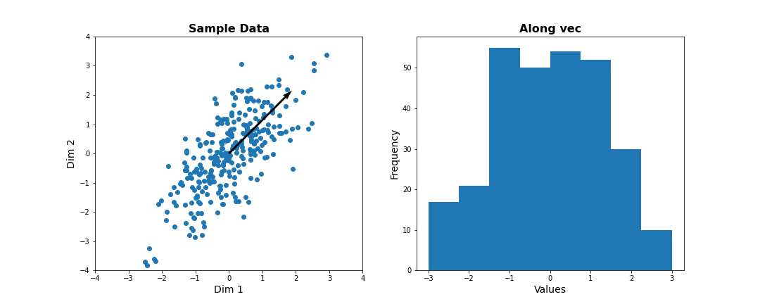
Do it Yourself
Change the angle in the code above and see how distribution of projected data changes. Use e.g. 0, \(\pi\) /2, 2/3*\(\pi\), and \(\pi\). Try to estimate how much the variance changes.
Now let’s formally calculate the variance by projecting along a set of different directions. We use angles between 0 and \(\pi\) (i.e. between 0 and 180 degrees). For each direction (projection) we calculate the variance and plot it against the angle.
PYTHON
allAngles = linspace( start=0, stop=pi, num=20)
allVar = []
for angle in allAngles:
    vec = array([cos(angle), sin(angle)]) #Unit length vector on which data will be projected
    dim1_data = data.dot(vec)
    allVar.append( var(dim1_data))

# Plot variance captured by different features
scatter( allAngles, allVar );
title('Variance along different directions', fontsize=16, fontweight='bold')
xlabel('Direction (angle in radians)', fontsize=14);
ylabel('Variance of projected data', fontsize=14);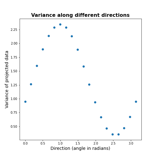
It can be seen there is a particular direction that retains maximal variance. This would be the optimal feature to give a 1D description of the 2D data while retaining maximum variability. PCA is the method that directly find this optimal direction. This makes it especially powerful for high dimensional datasets.
Find 1-D description using PCA
Let us now use dimensionality reduction PCA to directly
find the direction that captures maximal variance. For an n-dimensional
dataset, PCA finds a set of n new features, ranked by the
variance along each feature. See the Scikit-learn
documentation for information.
To get the best 1D representation of data, we instantiate the class with one component (n_components = 1) to be returned, and transform the data to the feature space of that component.
PYTHON
from sklearn.decomposition import PCA

# Initialize the PCA model
pcaResults = PCA(n_components=1, whiten=False) # specify no. of components, and whether to standardize

# Fit to data
pcaResults = pcaResults.fit(data)

# Transform the data, using our learned PCA representation
dim1_data = pcaResults.transform(data)

print( "Size of new dataset: ", dim1_data.shape )
Size of new dataset: (300, 1)
From the fitted model ‘pcaResults’ we can now get:
The fractional variance using
explained_variance_ratio_. It tells us what fraction of the total variance is retained by th reduced 1D description of the data.The direction (angle) of this first PC as calculate from the arcus tangens
atanof the vector. You can compare it directly to the angle in the above plot.
PYTHON
# How much variance was captured compared to original data?
print("Fractional variance captured by first PC: {:1.4f}.".format(pcaResults.explained_variance_ratio_[0]))
Fractional variance captured by first PC: 0.8722.
PYTHON
vec1 = pcaResults.components_[0,:]
print("Direction of PC1 is at angle = {:1.2f} radians".format(atan2(vec1[1],vec1[0])))
Direction of PC1 is at angle = 0.99 radians
Do it Yourself
Exercise (DIY): Change the covariance of the synthetic data, and repeat the above steps. Try to infer the relationship between the shape of the scatter, the strength of correlation between the two dimensions, and the variance captured by the first PC.
Find 2-D description using PCA
Our dataset has two features. We can thus obtain two principal components. The two components must be orthogonal to each other (form a right angle). Let us get the corresponding vectors and plot them on the scatterplot.
PYTHON
# Initialize the PCA model
pcaResults = PCA(n_components=2, whiten=False) # specify no. of components, and whether to standardize

# Fit to data
pcaResults = pcaResults.fit(data)

# Transform the data, using our learned PCA representation
dim1_data = pcaResults.transform(data)

print( "Size of new dataset: ", dim1_data.shape )
Size of new dataset: (300, 2)
[[ 0.54864625 0.8360546 ] [ 0.8360546 -0.54864625]]
PYTHON
vec1 = pcaResults.components_[0,:]
vec2 = pcaResults.components_[1,:]


fig, ax = subplots(figsize=(6, 6))

# Plot data and the feature direction
ax.scatter(zdata[:, 0], zdata[:, 1]);
ax.quiver([0], [0], vec1[0], vec1[1], scale=3, color='r');
ax.quiver([0], [0], vec2[0], vec2[1], scale=3, color='r');

ax.set_title('Sample Data', fontsize=16, fontweight='bold')
ax.set_xlabel('Dim 1', fontsize=14); ax.set_xlim([-4,4]);
ax.set_ylabel('Dim 2', fontsize=14); ax.set_ylim([-4,4]);

show()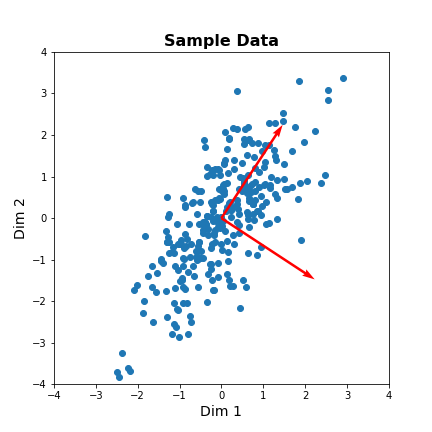
The red arrows show the new coordinate system, defined by the principal components. It also shows that the more correlated the data are, the less information we lose by reducing the data representation using PCA.
Important
When reading about PCA you will come across the term Singular
Value Decomposition (SVD). As mentioned in the Scikit-learn
documentation for PCA, when you apply PCA the algorithm
in the background uses SVD to return the results. The difference between
the two is technical but SVD is the more general method. Wikipedia has
as mathematical
introduction to PCA which also discusses the
relationship to SVD.
PCA of the Gene Expression Data
Now, we will use PCA to find a few features that capture most of the variability in the gene expression dataset. we arbitrarily start with 50 components assuming that this will include the important features.
PYTHON
nComp = 50 # Number of PCs to be returned
#trainIndx = binomial(1,0.9,size=filectr)

GenePCA = PCA(n_components=nComp, whiten=True)
GenePCA = GenePCA.fit(geneData) #.values[trainIndx==1,:]
How many features should we retain? To investigate this question, we plot the total (cumulative) variance for retaining the top k modes. The more we use, the higher the cumulative variance.
PYTHON
cumExpVar = cumsum(GenePCA.explained_variance_ratio_)
fig = figure(figsize=(5, 5))
im  = plot( range(nComp), cumExpVar )
xticks(arange(0,nComp,5));
xlabel( 'Number of PCs', fontsize=14);
ylabel('Cumulative explained variance', fontsize=14);

show()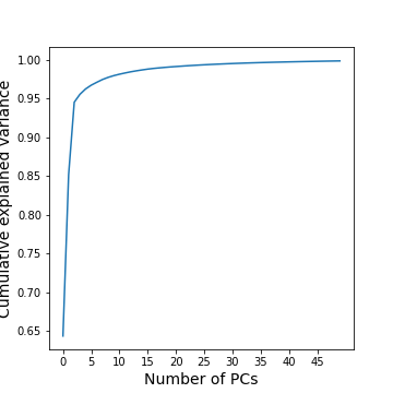
A common heuristic for choosing the number of components is by defining a set threshold for the total explained variance. Thresholds commonly vary between 0.8-0.9, depending on the structure of the PCs, e.g. depending on whether there are a few top PCs or many small PCs, but also depending on the expected noise in data, and on the desirable accuracy of the reduced data set. While a dimensionality reduction is convenient it always loses some information.
As an example, we can check how many PCs we need to retain 99 % of the variance.
PYTHON
threshold = 0.99

keepPC = [pc for pc in range(nComp) if cumExpVar[pc]>=threshold][0]

print('Number of features needed to explain {:1.2f} fraction of total variance is {:2d}. '.format(threshold, keepPC) )
Number of features needed to explain 0.99 fraction of total variance is 19.
There are many alternative methods for estimating the number of features. These include:
Plot explained variance of individual PCs and cut off when there is a sharp drop/saturation in the values.
Cross-validation - Find number of PCs that maximize explained variance on heldout data (using a bi-cross validation scheme).
Visual inspection or interpretable PCs
Visualization of reduced dataset
Now that we have selected the number of features to be used, we can see what the data along those features looks like.
PYTHON
newGeneData = GenePCA.transform(geneData)[:,range(keepPC)]

fig, ax = subplots(ncols=3, nrows=2, figsize=(18, 8))
suptitle('Data in new Feature space', fontsize=20)

ax[0, 0].scatter(newGeneData[:,0], newGeneData[:,1], c=range(filectr), cmap='summer');
ax[0, 0].set_xlabel('PC1', fontsize=14); ax[0, 0].set_xlim([-2,2]);
ax[0, 0].set_ylabel('PC2', fontsize=14); ax[0, 0].set_ylim([-2,2]);


ax[0, 1].scatter(newGeneData[:,0], newGeneData[:,2], c=range(filectr), cmap='summer');
ax[0, 1].set_xlabel('PC1', fontsize=14); ax[0, 1].set_xlim([-2,2]);
ax[0, 1].set_ylabel('PC3', fontsize=14); ax[0, 1].set_ylim([-2,2]);


ax[0, 2].scatter(newGeneData[:,0], newGeneData[:,3], c=range(filectr), cmap='summer');
ax[0, 2].set_xlabel('PC1', fontsize=14); ax[0, 2].set_xlim([-2,2]);
ax[0, 2].set_ylabel('PC4', fontsize=14); ax[0, 2].set_ylim([-2,2]);


ax[1, 0].scatter(newGeneData[:,1], newGeneData[:,2], c=range(filectr), cmap='summer');
ax[1, 0].set_xlabel('PC2', fontsize=14); ax[1, 0].set_xlim([-2,2]);
ax[1, 0].set_ylabel('PC3', fontsize=14); ax[1, 0].set_ylim([-2,2]);


ax[1, 1].scatter(newGeneData[:,1], newGeneData[:,3], c=range(filectr), cmap='summer');
ax[1, 1].set_xlabel('PC2', fontsize=14); ax[1, 1].set_xlim([-2,2]);
ax[1, 1].set_ylabel('PC4', fontsize=14); ax[1, 1].set_ylim([-2,2]);


ax[1, 2].scatter(newGeneData[:,3], newGeneData[:,2], c=range(filectr), cmap='summer');
ax[1, 2].set_xlabel('PC4', fontsize=14); ax[1, 2].set_xlim([-2,2]);
ax[1, 2].set_ylabel('PC3', fontsize=14); ax[1, 2].set_ylim([-2,2]);

show()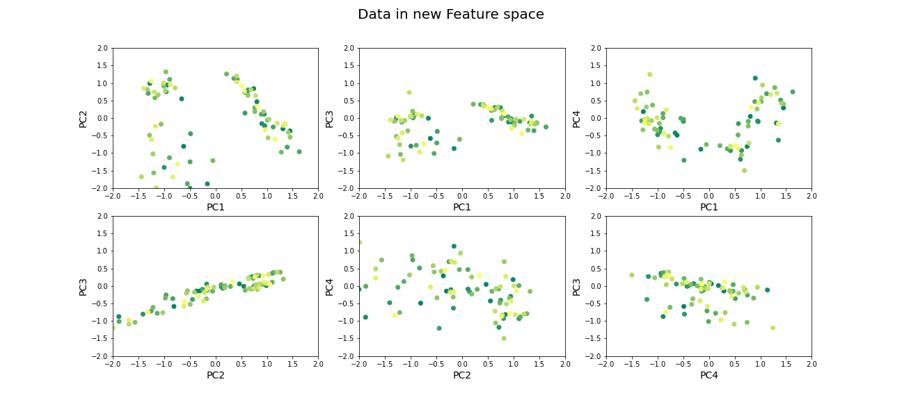
Beyond dimensionality reduction
After reducing dataset from hundreds or thousands of genes to fewer features (PCs), it can be used:
To find groups of genes that seem to be co-regulated (using clustering).
To build classifiers to predict the likelihood of juvenile or late-onset rheumatoid disease. For example, one feature can be highly variable in the sampled population and therefore has high explained variance, but it may not predictive for the current objective of predicting disease phenotype (e.g. eye pigmentation genes).
To find what combination of genes the top features correspond to.
To suggest what individual genes are most variable.
To discover co-expression patterns of multiple genes.
Optional Exercises
The dataset contains two types of samples, expression in neutrophil and expression in peripheral blood mononuclear cells (PBMC). Download the sample-data table to get the category of each sample. Make a scatter plot of two (original) features and set the colour of the scatter based on the sample’s origin. Do a PCA, scatter the top scoring components and colour the samples in the same way. Do the top PCs capture gene expression differences in the two types of cells?
The dataset similarly contains samples from individuals with differing phenotypes - healthy, as well as 2 different disease characteristics. Similar to the previous exercise, colour the scatter based on the disease phenotypes. Do the top PCs capture variability in gene expression for different phenotypes?
When does PCA fail?
Although PCA is the first and simplest method of exploring high-dimensional datasets, there are important caveats to keep in mind:
- PCA is a linear method
Nonlinear patterns of co-expression will be seemingly broken up into many features. Thus, the ability to find whether genes are co-regulated may be reduced if the effects are nonlinear.
- PCA depends on scaling of individual measurements.
As PCA measures variance along different directions, changing the scale of one variable (for example from cm to mm, or fold-change to actual levels) may drastically change the dominant “features” extracted.
The lesson on clustering of images with Gaussian mixture models contained instructions to scale data. You can explore the original dataset of this lesson, to investigate how scaling of variables impacts the results.
- Estimating number of features is heuristic, and depends on the purpose.
The definition of what is the ‘relevant’ number of features can depend on:
- the signal-to-noise ratio in data. For example, noisier or smaller datasets make it harder to accurately estimate smaller PCs. In such cases, a more conservative threshold should be used.
- the classifier or regression performance following the dimensionality reduction.
Resources
Dataset from:
Frank MB, Wang S, Aggarwal A, et al. Disease-associated pathophysiologic structures in pediatric rheumatic diseases show characteristics of scale-free networks seen in physiologic systems: implications for pathogenesis and treatment. BMC Med Genomics. 2009;2:9. Published 2009 Feb 23. doi:10.1186/1755-8794-2-9
Download data from: https://www.ebi.ac.uk/arrayexpress/experiments/E-GEOD-11083/
Key Points
- Reduced features in a dataset reduce redundancy and process is called dimensionality reduction.
- Principal component analysis (PCA) is one of the commonly used dimensionality reduction methods.
-
n_componentsis used specify the number of components inScikit-learn. - PCA can be helpful to find groups of genes that seem to be co-regulated.